Data

Signal vs Noise: How Process Behaviour Charts can enable more effective Product Operations

In today’s product world, being data-driven (or data-led) is a common goal, but misinterpreting data can lead to wasted resources and missed opportunities. For Product Operations teams, distinguishing meaningful trends (signal) from random fluctuations (noise) is critical. Process Behaviour Charts (PBCs) provide a powerful tool to focus on what truly matters, enabling smarter decisions and avoiding costly mistakes…

What Product Operations is (and is not)

Effective enablement is the cornerstone of Product Operations. Unfortunately, many teams risk becoming what Marty Cagan calls “process people” or even the reincarnated PMO. Thankfully, Melissa Perri and Denise Tilles provide clear guidance in their book, Product Operations: How successful companies build better products at scale, which outlines how to establish a value-adding Product Operations function.

In the book there are three core pillars to focus on to make Product Operations successful. I won’t spoil the other two, but the one to focus on for this post is the data and insights pillar. This is is all about enabling product teams to make informed, evidence-based decisions by ensuring they have access to reliable, actionable data. Typically this means centralising and democratizing product metrics and trying to foster a culture of continuous learning through insights. In order to do this we need to visualise data, but how can we make sure we’re enabling in the most effective way in doing this?

Visualising data and separating signal from noise

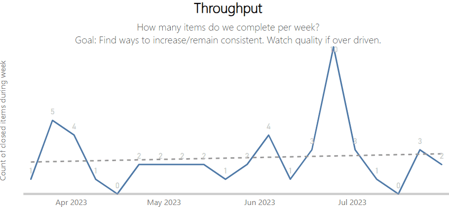
When it comes to visualising data, another must read book is Understanding Variation: The Key To Managing Chaos by Donald Wheeler. This book highlights so much about the fallacies in organisations that use data to monitor performance improvements. It explains how to effectively interpret data in the context of improvement and decision-making, whilst emphasising the need to understand variation as a critical factor in managing and improving performance. The book does this through the introduction of a Process Behaviour Chart (PBC). A PBC is a type of graph that visualises the variation in a process over time. It consists of a running record of data points, a central line that represents the average value, and upper and lower limits (referred to as Upper Natural Process Limit — UNPL and Lower Natural Process Limit — LNPL) that define the boundaries of routine variation. A PBC can help to distinguish between common causes and exceptional causes of variation, and to assess the predictability and stability of data/a process.

An example of a PBC is the the chart below, where the daily takings on the fourth Saturday of the month could be ‘exceptional variation’ compared to normal days:

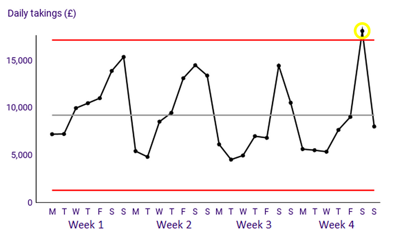
Deming Alliance — Process Behaviour Charts — An Introduction

If we bring these ideas together, an effective Product Operations department that is focusing on insights and data should be all about distinguishing signal from noise. If you aren’t familiar with the term, signal is what you should be looking at, this is the meaningful information you want to focus on, after all, the clue is in the name! Noise is all the random variation that interferes with it. If you want to learn more, the book The Signal and The Noise is another great resource to aid your learning around this topic. Unfortunately, too often in organisations when we work with data people wrongly misinterpret that which is noise to in fact be signal. For Product Operations to be adding value, we need to be pointing our Product teams to signals and cutting out the noise in typical metrics we track.

But what good is theory without practical application?

An example

Let’s take a look at four user/customer related metrics for an eCommerce site from the beginning of December up until Christmas last year:

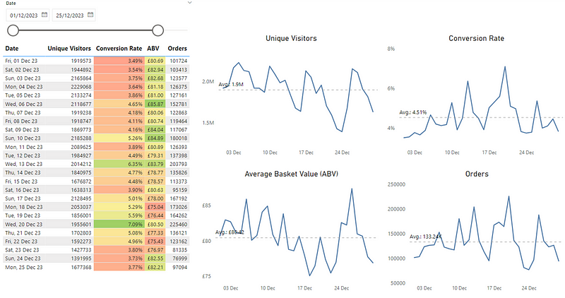
The use of colour in the table draws the viewer to this information as it is highlighted. What then ends up happening is a supporting narrative something like so, which typically comes from those monitoring the numbers:

The problem here is that noise (expected variation in data) is being mistaken for signal (exceptional variation we need to investigate), particularly as it is influenced through the use of colour (specifically the RAG scale). The metrics of Unique Visitors and Orders contain no use of colour so there’s no way to determine what, if anything, we should be looking at. Finally, our line charts don’t really tell us anything other than if values are above/below average and potentially trending.

A Product Operations team shows value-add in enabling the organisation be more effective in spotting opportunities and/or significant events that others may not see. If you’re a PM working on a new initiative/feature/experiment, you want to know if there are any shifts in the key metrics you’re looking at. Visualising it in this ‘generic’ way doesn’t allow us to see that or, could in fact be creating a narrative that isn’t true. This is where PBCs can help us. They can highlight where we’re seeing exceptional variation in our data.

Coming back to our original example, let’s redesign our line chart to be a PBC and make better usage of colour to highlight large changes in our metrics:

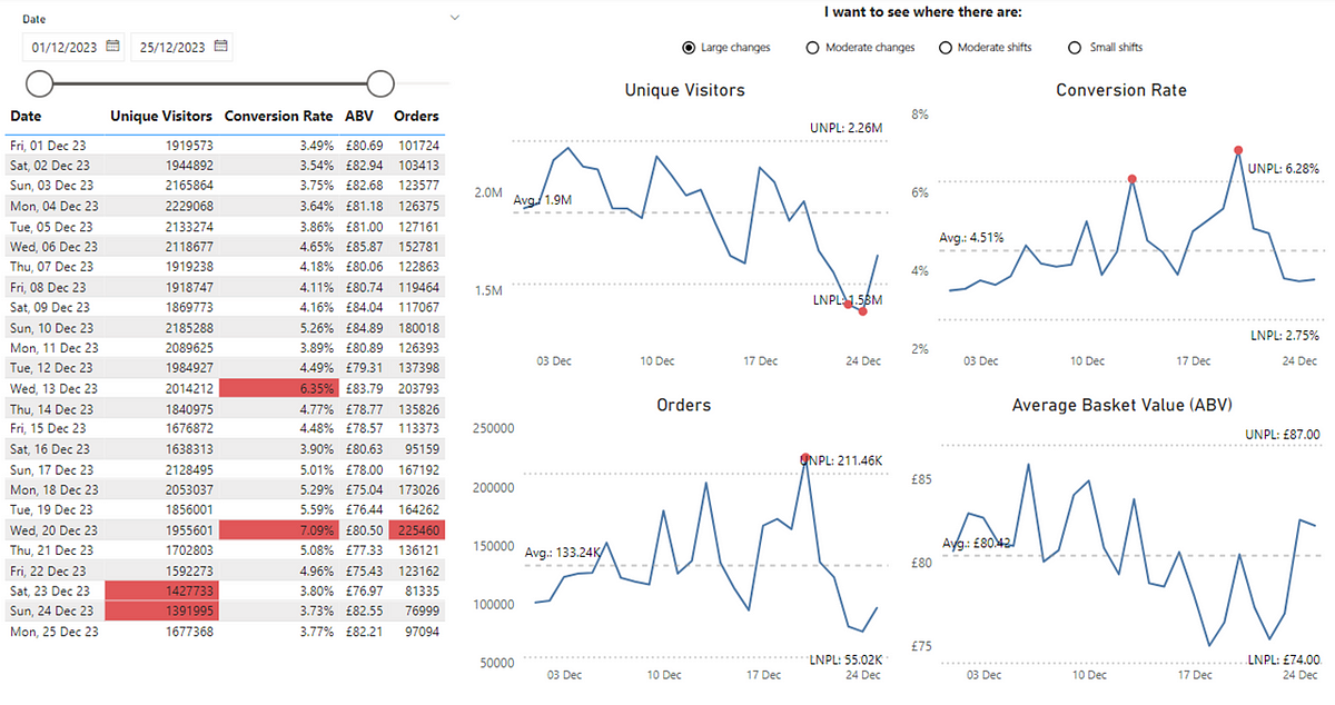
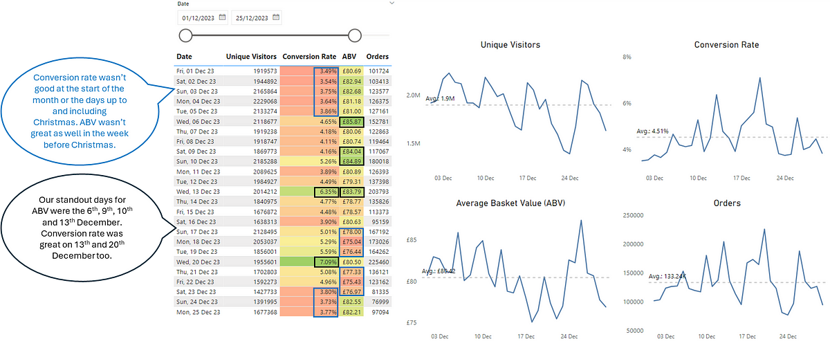
We can see that we weren’t ‘completely’ wrong, although we have missed out a lot more useful information. We can see that Conversion Rate for the 13th and 20th December was in fact exceptional variation from the norm, so the colour highlighting of this did make sense. However, the narrative around Conversion Rate performing badly at the start of the month (with the red background in the cells in our original table) as well as up to and including Christmas is not true, as this was just routine variation that was within values we expected.

For ABV we can also see that there was no significant event up to and including Christmas, so it neither performed ‘well’ or ‘not so well’ as the values every day were within our expected variation. What is interesting is that we can see we have dates where we have seen exceptional variation in both our Orders and Unique Visitors, which should prompt further investigation. I say further investigation as these charts, like nearly all data visualisation doesn’t give you answers, it just gets you asking better questions. It’s worth noting that for certain events (e.g. Black Friday) these may appear as ‘signal’ in your data but in fact it’s pretty obvious as to the cause.

Exceptional variation in terms of identifying those significant events isn’t the only usage for PBCs. We can use these to spot other, more subtle changes in data. Instead of large changes we can also look at moderate changes. These draw attention to patterns inside ‘noisy’ data that you might want to investigate (of course after you’ve checked out those exceptional variation values). For simplicity, this happens when two out of three points in a row are noticeably higher than usual (above a certain threshold not shown in these charts). This can provide new insight that wasn’t seen previously, such as our metrics of Unique Visitors and Orders, which previously had no ‘signal’ to consider:

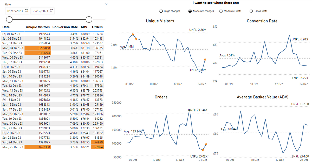
Now we can see points where there has been a moderate change. We can then start to ask questions such as could this be down to a new feature, a marketing campaign or promotional event? Have we improved our SEO? Were we running an A/B test? Or is it simply just random fluctuation?

Another use of PBCs centre on sustained shifts which, when you’re working in the world of product management is a valuable data point to have at your disposal. To be effective at building products, we have to focus on outcomes. Outcomes are a measurable change in behaviour. A measurable change in behaviour usually means a sustained (rather than one-off) shift. In PBCs, moderate, sustained shifts indicate a consistent change which, when analysing user behaviour data means a sustained change in the behaviour of people using/buying our product. This happens when four out of five points in a row are consistently higher than usual, based on a specific threshold (not shown in these charts). We can now see where we’ve had moderate, sustained shifts in our metrics:

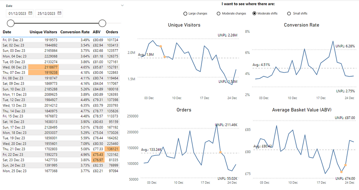
Again we don’t know what the cause of this is but, it focuses our attention on what we have been doing around those dates. Particularly for our ABV metricwe might want to reconsider our approach given the sustained change that appears to be on the wrong side of the average.

The final sustained change focus on smaller, sustained changes. This is a run of at least 8 successive data points within the process limits on the same side of the average line (which could be above or below):

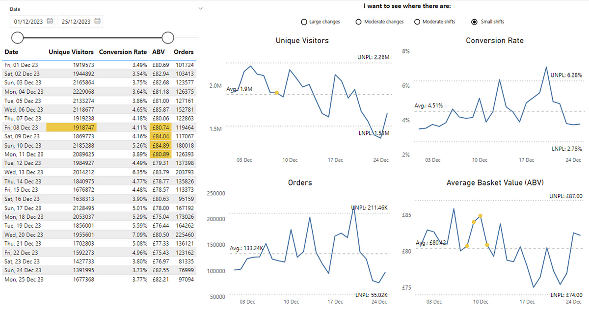
For our example here, we’re seeing this for Unique Visitors, which is good as we’re seeing a small, sustained change in the website’s traffic above the average. Even clearer is for ABV, with multiple points above the average indicating a positive (but small) shift in customer purchasing behaviour.

Key Takeaways

Hopefully, this blog provides some insight into how PBCs enable Product Operations to support data-driven decisions while avoiding common data pitfalls. By separating signal from noise, organisations can prevent costly errors like unnecessary resource allocation, misaligned strategies, or failing to act on genuine opportunities. In a data-rich world, PBCs are not just a tool for insights — they’re a safeguard against the financial and operational risks of misinterpreting data.

In terms of getting started, consider any of the metrics you look at now (or provide the organisation) as a Product Operations team. Think about how you differentiate signal from noise. What’s the story behind your data? Where should people be drawn to? How do we know when there are exceptional events or subtle shifts in our user behaviour? If you can’t easily tell or have different interpretations, then give PBCs a shot. As you grow more confident, you’ll find PBCs an invaluable tool in making sense of your data and driving product success.

If you’re interested in learning more about them, check out Wheeler’s book (I picked up mine for ~£10 on eBay) or if you’re after a shorter (and free!) way to learn as well as how to set them up with the underlying maths, check out the Deming Alliance as well as this blog from Tom Geraghty on the history of PBCs.

Outcome focused roadmaps and Feature Monte Carlo unite!

Shifting to focusing on outcomes is key for any product operating model to be a success, but how do you manage the traditional view on wanting to see dates for features, all whilst balancing uncertainty? I’ll share how you can get the best of both worlds with a Now/Next/Later X Feature Monte Carlo roadmap…

What is a roadmap?

A roadmap could be defined as one (or many) of the following:

Where do we run into challenges with roadmaps?

Unfortunately, many still view roadmaps as merely a delivery plan to execute. They simply want a list of Features and when they are going to be done by. Now, sometimes this is a perfectly valid ask, for example if efforts around marketing or sales campaigns are dependent on Features in our product and when they will ship. More often than not though, it is a sign of low psychological safety. Teams are forced to give date estimates when they know the least and are then “held to account” for meeting that date that is only formulated once, rather than being reviewed continuously based on new data and learning. Delivery is not a collaborative conversation between stakeholders and product teams, it’s a one-way conversation.

What does ‘good’ look like?

Good roadmaps are continually updated based on new information, helping you solicit feedback and test your thinking​, surface potential dependencies and ultimately achieve the best outcomes with the least amount of risk and work​.

In my experience, the most effective roadmaps out there find the ability to tie the vision/mission for your product to the goals, outcomes and planned features/solutions for the product. A great publicly accessible example is the AsyncAPI roadmap:

A screenshots of the ASyncAPI roadmap

Vision & Roadmap | AsyncAPI Initiative for event-driven APIs

Here we have the whole story of the vision, goals, outcomes and the solutions (features) that will enable this all to be a success.

To be clear, I’m not saying this is the only way to roadmap, as there are tonnes of different ways you can design yours. In my experience, the Now / Next / Later roadmap, created by Janna Bastow, provides a great balance in giving insight into future trajectory whilst not being beholden to dates. There are also great templates from other well known product folk such as Melissa Perri’s one here or Roman Pichler's Go Product Roadmap to name a few. What these all have in common is they are able to tie vision, outcomes (and even measures) as well as features/solutions planned to deliver into one clear, coherent narrative.

Delivery is often the hardest part though, and crucially how do we account for when things go sideways?

The uncertainty around delivery

Software development is inherently complex, requiring probabilistic rather than deterministic thinking about delivery. This means acknowledging that there are a range of outcomes that can occur, not a single one. To make informed decisions around delivery we need to be aware of the probability of that outcome occurring so we can truly quantify the associated “risk”.

I’ve covered in a previous blog about using a Feature Monte Carlo when working on multiple features at once. This is a technique teams adopt in understanding the consequences around working on multiple Features (note: by Feature I mean a logical grouping of User Stories/Product Backlog Items), particularly if you have a date/deadline you are working towards:

An animation of a feature monte carlo chart

Please note: all Feature names are fictional for the purpose of this blog

Yet this information isn’t always readily accessible to stakeholders and means navigating to multiple sources, making it difficult to tie these Features back to the outcomes we are trying to achieve.

So how can we bring this view on uncertainty to our roadmaps?

The Now/Next/Later X Feature Monte Carlo Roadmap

The problem we’re trying to solve is how can we quickly and (ideally) cheaply create an outcome oriented view of the direction of our product, whilst still giving that insight into delivery stakeholders need, AND balance the uncertainty around the complex domain of software development?

This is where our Now/Next/Later X Feature Monte Carlo Roadmap comes into the picture.

Using Azure DevOps (ADO) as our tool of choice, which has a work item hierarchy of Epic -> Feature -> Product Backlog Item/User Story. With some supporting guidance, we can make it clear around what each level should entail:

An example work item hierarchy in Azure DevOps

You can of course rename these levels if you wish (e.g. OKR -> Feature -> Story) however we’re aiming to do this with no customisation so will stick with the “out-the-box” configuration. Understanding and using this setup is important as this will be the data that feeds into our roadmap.

Now let’s take a real scenario and show how this plays out via our roadmap. Let’s say we were working on launching a brand new loyalty system for our online eCommerce site, how might we go about it?

Starting with the outcomes, let’s define these using the Epic work item type in our backlog, and where it sits in our Now/Next/Later roadmap (using ‘tags’). We can also add in how we’ll measure if those outcomes are being achieved:

An example outcome focused Epic in ADO

Note: you don’t have to use the description field, I just did it for simplicity purposes!

Now we can formulate the first part of our roadmap:

A Now, Next, Later roadmap generated from ADO data

For those Epics tagged in the “Now”, we’re going to decompose those (ideally doing this as team!) into multiple Features and relevant Product Backlog Items (PBIs). This of course should be done ‘just in time’, rather than doing it all up front. Techniques like user story mapping from Jeff Patton are great for this. In order to get some throughput (completed PBIs) data, the team are then going to start working through these and moving items to done. Once we have sufficient data (generally as little as 4 weeks worth is enough), we can then start to view our Feature Monte Carlo, playing around with the parameters involved:

A Feature Monte Carlo generated from ADO data

The real value emerges when we combine these two visuals. We can have the outcome oriented lens in the Now / Next / Later and, if people want to drill down to see where delivery of those Features within that Epic (Outcome) is, they can:

A now, next, later roadmap being filtered to show the Feature Monte Carlo

They can even play around with the parameters to understand just what would need to happen in order to make that Feature that’s at risk (Red/Amber) a reality (Green) for the date they have in mind:

A now, next, later roadmap being filtered to show the Feature Monte Carlo

It’s worth noting this only works when items in the “Now” have been broken down into Features. For our “Next” and “Later” views, we deliberately stop the dynamic updates as items at these horizons should never be focused on specific dates.

Similarly, we can also see where we have Features with 0 child items that aren’t included in the monte carlo forecast. This could be that either they’re yet to be broken down or that all the child items in it are complete but the Feature hasn’t yet moved to “done” — for example if it is waiting feedback. Similarly, it also highlights those Features that may not be linked to a parent Epic (Outcome):

A Feature monte carlo highlighted with Features without parents and/or children.

Using these tools allows for our roadmap becomes an automated, “living” document generated from our backlog that shows outcomes and the expected dates of the Features that can enable those outcomes to be achieved. Similarly, we can have a collaborative conversation around risk and what factors (date, confidence, scope change, WIP) are at play. In particular, leverage the power of adjusting WIP means we can finally add proof to that agile soundbite of “stop starting, start finishing”.

Interested in giving this a try? Check out the GitHub repo containing the Power BI template then plug in your ADO data to get started…

Mastering flow metrics for Epics and Features

Flow metrics are a great tool for teams to leverage for an objective view in their efforts towards continuous improvement. Why limit them to just teams? 

This post reveals how, at ASOS, we are introducing the same concepts but for Epic and Feature level backlogs…

Flow at all levels

Flow metrics are one of the key tools in the toolbox that we as coaches use with teams. They are used as an objective lens for understanding the flow of work and measuring the impact of efforts towards continuous improvement, as well as understanding predictability.

One of the challenges we face is how we can improve agility at all levels of the tech organisation. Experience tells us that it does not really matter if you have high-performing agile teams if they are surrounded by other levels of backlogs that do not focus on flow:

Source:

Jon Smart

(via

Klaus Leopold — Rethinking Agile

)

As coaches, we are firm believers that all levels of the tech (and wider) organisation need to focus on flow if we are to truly get better outcomes through our ways of working.

To help increase this focus on flow, we have recently started experimenting with flow metrics at the Epic/Feature level. This is mainly because the real value for the organisation comes at this level, rather than at an individual story/product backlog item level. We use both Epic AND Feature level as we have an element of flexibility in work item hierarchy/levels (as well as having teams using Jira AND Azure DevOps), yet the same concepts should be applicable. Leaving our work item hierarchy looking something like the below:

Note: most of our teams use Azure DevOps — hence the hierarchy viewed this way

Using flow metrics at this level comprises of the typical measures around Throughput, Cycle Time, Work In Progress (WIP) and Work Item Age, however, we provide more direct guidance around the questions to ask and the conversations to be having with this information…

Throughput

Throughput is the number of Epics/Features finished per unit of time. This chart shows the count completed per week as well as plotting the trend over time. The viewer of the chart is able to hover over a particular week to get the detail on particular items. It is visualised as a line chart to show the Throughput values over time:

In terms of how to use this chart, some useful prompts are:

What work have we finished recently and what are the outcomes we are seeing from this?

Throughput is more of an output metric, as it is simply a count of completed items. What we should be focusing on is the outcome(s) these items are leading to. When we hover on a given week and see items that are more ‘customer’ focused we should then be discussing the outcomes we are seeing, such as changes in leading indicators on measures like unique visits/bounce rate/average basket value on ASOS.com.

For example, if the Epic around Spotify partnerships (w/ ASOS Premier accounts) finished recently:

We may well be looking at seeing if this is leading to increases in ASOS Premier sign-ups and/or the click-through rate on email campaigns/our main site:

The click-through rate for email/site traffic could be a leading indicator for the outcomes of that Epic

If an item is more technical excellence/tech debt focused then we may be discussing if we are seeing improvements in our engineering and operational excellence scores of teams.

What direction is the trend? How consistent are the values?

Whilst Throughput is more output-oriented, it could also be interpreted as a leading indicator for value. If your Throughput is trending up/increasing, then it could suggest that more value is being delivered/likely to be delivered. The opposite would be if it is trending downward.

We also might want to look at the consistency of the values. Generally, Throughput for most teams is ‘predictable’ (more on this in a future post!) however it may be that there are spikes (lots of Epics/Features moving to ‘Done’) or periods or zeros (where no Epics/Feature moved to ‘Done’) that an area needs to consider:

Yes, this is a real platform/domain!

Do any of these items provide opportunities for learning/should be the focus of a retrospective?

Hovering on a particular week may prompt conversation about particular challenges had with an item. If we know this then we may choose to do an Epic/Feature-based retrospective. This sometimes happens for items that involved multiple platforms. Running a retrospective on the particular Epic allows for learning and improvements that can then be implemented in our overall tech portfolio, bringing wider improvements in flow at our highest level of work.

Cycle Time

Cycle Time is the amount of elapsed time between when an Epic/Feature started and when it finished. Each item is represented by a dot and plotted against its Cycle Time (in calendar days). In addition to this, the 85th and 50th percentile cycle times for items in that selected range are provided. It is visualised as a scatter plot to easily identify patterns in the data:

In terms of how to use this chart, some useful prompts are:

What are the outliers and how can we learn from these?

Here we look at those Epics/Features that are towards the very top of our chart, meaning they took the longest:

These are useful items to deep dive into/run a retrospective on. Finding out why this happened and identifying ways to try to improve to prevent this from happening encourages continuous improvement at a higher level and ultimately aids our predictability.

What is our 85th percentile? How big is the gap between that and our 50th percentile?

Speaking of predictability, generally, we advise platforms to try to keep Features to be no greater than two months and Epics to be no greater than four months. Viewing your 85th percentile allows you to compare what your actual size for Epics/Features is, compared to the aspiration of the tech organisation. Similarly, we can see where there is a big gap in those percentile values. Aligned with the work of Karl Scotland, too large a gap in those values suggests there may be too much variability in your cycle times.

What are the patterns from the data?

This is the main reason for visualising these items in a scatter plot. It becomes very easy to spot when we are closing off work in batches and have lots of large gaps/white space where nothing is getting done (i.e. no value being delivered):

We can also see maybe where we are closing Epics/Features frequently but have increased our variability/reduced our predictability with regards to Epic/Feature cycle time:

Work In Progress (WIP)

WIP is the number of Epics/Features started but not finished. The chart shows the number of Epics/Features that were ‘in progress’ on a particular day. A trend line shows the general direction WIP is heading. It is visualized as a stepped line chart to better demonstrate changes in WIP values:

In terms of how to use this chart, some useful prompts are:

What direction is it trending?

We want WIP to be level/trending downward, meaning that an area is not working on too many things. An upward trend alludes to potentially a lack of prioritisation as more work is starting and then remaining ‘in progress’.

Are we limiting WIP? Should we change our WIP limits (or introduce them)?

If we are seeing an upward trend it may well be that we are not actually limiting WIP. Therefore we should be thinking about that and discussing if WIP limits are needed as a means of introducing focus for our area. If we are using them, advanced visuals may show us how often we ‘breach’ our WIP limits:

A red dot represents when a column breached its WIP limit

Hovering on a dot will detail which specific column breached its WIP on the given day and by how much.

What was the cause of any spikes or drops?

Focusing on this chart and where there are sudden spikes/drops can aid improvement efforts. For example, if there was a big drop on a given date (i.e. lots of items moved out of being in progress), why was that? Had we lost sight of work and just did a ‘bulk’ closing of items? How do we prevent that from happening again?

The same goes for spikes in the chart— meaning lots of Epics/Features moved in progress. It certainly is an odd thing to see happen at Epic/Feature level but trust me it does happen! You might be wondering when could this happen — in the same way, some teams hold planning at the beginning of a sprint and then (mistakenly) move everything in progress at the start of the sprint, an area may do the same after a semester planning event — something we want to avoid.

Work Item Age

Work Item Age shows the amount of elapsed time between when an Epic/Feature started and the current time. These items are plotted against their respective status in their workflow on the board. For the selected range, the historical cycle time (85th and 50th percentile) is also plotted. Hovering on a status reveals more detail on what the specific items are and the completed vs. remaining count of their child items. It is visualised as a dot plot to easily see comparison/distribution:

In terms of how to use this chart, some useful prompts are:

What are some of our oldest items? How does this compare to our historical cycle time?

This is the main purpose of this chart, it allows us to see which Epics/Features have been in progress the longest. These really should be the primary focus as this represents the most risk for our area as they have been in flight the longest without feedback. In particular, those items that are above our 85th percentile line are a priority, as now these are larger than 85% of the Epics/Features we completed in the past:

The items not blurred are our oldest and would be the first focus point

The benefit of including the completed vs. remaining (in terms of child item count) provides additional context so we can then also understand how much effort we have put in so far (completed) and what is left (remaining). The combination of these two numbers might also indicate where you should be trying to break these down as, if a lot of work has been undertaken already AND a lot remains, chances are this hasn’t been sliced very well.

Are there any items that can be closed (Remaining = 0)?

These are items we should be looking at as, with no child items remaining, it looks like these are finished.

The items not blurred are likely items that can move to ‘Done’

Considering this, they really represent ‘quick wins’ that can get an area flowing again — getting stuff ‘done’ (thus getting feedback) and in turn reducing WIP (thus increasing focus). In particular, we’ve found visualizing these items has helped our Platform Leads in focusing on finishing Epics/Features.

Why are some items in progress (Remaining = 0 and Completed = 0)?

These are items we should be questioning why they are actually in progress.

Items not blurred are likely to be items that should not be in progress

With no child items, these may have been inadvertently marked as ‘in progress’ (one of the few times to advocate for moving items backwards!). It may, in rare instances, be a backlog ‘linking’ issue where someone has linked child items to a different Epic/Feature by mistake. In any case, these items should be moved backwards or removed as it’s clear they aren’t actually being worked on.

What items should we focus on finishing?

Ultimately, this is the main question this chart should be enabling the conversation around. It could be the oldest items, it could be those with nothing remaining, it could be neither of those and something that has become an urgent priority (although ignoring the previous two ‘types’ is not advised!). Similarly, you should also be using it in proactively managing those items that are getting close to your 85th percentile. If they are close to this value, it’s likely focusing on what you need to do in order to finish these items should be the main point of discussion.

Summary

Hopefully, this post has given some insights about how you can leverage flow metrics at Epic/Feature Level. In terms of how frequently you should look at these then, at a minimum, I’d recommend this is done weekly. Doing it too infrequently means it is likely your teams will be unclear on priorities and/or will lose sight of getting work ‘done’. If you’re curious how we do this, these charts are generated for teams using either Azure DevOps or Jira, using a Power BI template (available in this repo).

Comment below if you find this useful and/or have your own approaches to managing flow of work items at higher levels in your organisation…

The Full Monte

Probabilistic forecasting by Agile teams is increasingly becoming a more common practice in the industry, particularly due to the great work of people such as Larry Macherrone, Troy Magennis, Julia Wester, Dan Vacanti and Prateek Singh. One question that isn’t particularly well documented is how accurate is it? Here we look at 25 ASOS teams’ data to find out just how right (or wrong!) it really is…

Whatever your views on the relevance in 2023 of the Agile Manifesto, no practitioner should ignore the very first line of “uncovering better ways”. I’ve always tried to hold myself and peers I work with true to that statement, with one of my biggest learning/unlearning moments being around velocity and story points. Instead of these approaches, moving towards techniques such as probabilistic forecasting and Monte Carlo simulation (I have Bazil Arden to thank for introducing me to it many years ago) is more aligned to modern, more complex environments. I don’t intend to cover the many pitfalls of story points and/or velocity, mainly because I (and many others) have covered this in great detail previously.

The challenge we face with getting people to adopt approaches such as probabilistic forecasting is that those sceptical will often default to asking, “well how accurate is it?” which can often lead to many people being confused. “Erm…not sure” or “well it’s better than what you do currently” are often answers that unfortunately don’t quite cut it for those wanting to learn about it and potentially adopt it.

Whilst those familiar with these techniques will be aware that all models are wrong, we can’t begrudge those who are motivated by seeing evidence in order to convince them to adopt a new way of working. After all, this is how the diffusion of innovations works, with those in the early majority and late majority motivated by seeing social proof, aka seeing it working (ideally in their context):

Source:

BVSSH

Yet social proof in the context of probabilistic forecasting is hard to come by. Many champion it as an approach, but very few share just how successful these forecasts are, making it very difficult for this idea to “cross the chasm”.

Why validating forecasts is important

The accuracy of forecasts is not only important for those wanting to see social proof of them working, but this should in fact matter for anyone practicing forecasting. As Nate Silver says in the Signal and the Noise:

One of the most important tests of a forecast — I would argue that it is the single most important one — is called calibration. Out of all the times you said there was a 40 percent chance of rain, how often did rain actually occur? If, over the long run, it really did rain about 40 percent of the time, that means your forecasts were well calibrated. If it wound up raining just 20 percent of the time instead, or 60 percent of the time, they weren’t.

A quick sense check for anyone using these approaches should be about just how frequently they validate what was forecast against the actual outcome. In the same way when it’s forecast to be sunny and a rain shower occurs, people don’t forget significantly wrong forecasts — just ask Michael Fish!

[embed]https://www.youtube.com/watch?v=NnxjZ-aFkjs[/embed]

Therefore, it’s essential when using these probabilistic approaches that we regularly validate the difference in what we forecast vs. what occurred, using that as learning to tweak our forecasting model.

How we forecast

Coming back to the matter at hand, it’s worth noting that there is no single approach to Monte Carlo simulation. The simplest (and the one we coach our teams to use) is to use random sampling — taking a random number from a random distribution. You can however have other approaches (for example Markov Chain), but it is not intended for the scope of this blog to compare these. If you would like to know more, I’d highly recommend Prateek Singh’s blog comparing the effectiveness of each approach.

For our teams here at ASOS, we use random sampling of historical weekly throughput:

This then feeds into our forecasts on “when will it be done?” or “what will we get?” — the two questions most commonly asked of our teams.

Each forecast contains 10,000 simulations, with the outcome distribution viewed as a histogram. Colour coding shows a percentile likelihood for an outcome — for example, in the image shown we can see that for When Will It Be Done we are 85% likely (furthest left ‘green bar’) to take 20 weeks or less to complete 100 items. For What Will We Get we are 85% likely (furthest right ‘green bar’) to complete 27 items or more in the next six weeks.

There is also a note on the x-axis of the stability of the input data.

This shows the stability between two random groups of the samples we are using.

Forecast factors

In terms of what I set out to achieve with this, there were four main things I wanted to be more informed about:

  1. Just how wrong are the forecasts?

  2. What percentile (50th / 70th / 85th) is ‘best’ to use?

  3. How big a factor is the amount of historical data that you use?

  4. How different are the results in short term (2–4 weeks) and long term (12–16 weeks) forecasts?

In terms of the forecasting approach, the focus was on the ‘what will we get?’ forecast, mainly due to this being easier to do at scale and that very few of our teams have strict, imposed delivery date deadlines. Historical data of 6, 8, 10 and 12 weeks was used to forecast for a given period (in this example, the next 2 weeks) the number of items a team would complete.

This would then be captured for each team, with forecasts for 2, 4, 8 and 12 weeks using 6–12 weeks’ historical data. The forecasts to be used to compare would be the 50th, 70th and 85th percentiles.

A snapshot of the forecast table looking like so:

In total I used 25 teams, with 48 forecasts per team, meaning there were 1200 forecasts to compare.

Anyone who has used these approaches in the past will know how important a factor having historical data that is a fair reflection of the same work you will be doing in the future. Across 25 teams this is somewhat hard to do, so I settled with choosing a time of year for historical data that could (at best) reflect the forecast period for bank holidays in the UK. With the forecast being done on 25th April 2022 it incorporated two previous bank holidays (15th and 18th April 2022 respectively). The next 2–4 weeks from the forecast date having one bank holiday (2nd May 2022), the 8–12 weeks having three (2nd May, 2nd June and 3rd June 2022) bank holidays.

Validating forecast accuracy

After a brief DM exchange with Prateek, he informed me of an approach he had taken in the past where he had used brier score. This is a way to verify the accuracy of a probability forecast.

Whilst this is completely valid as an approach, for an audience that can take a while to grasp the concept of Monte Carlo simulation, I decided best to not add another data science element! Similarly, people are more interested in if, say you forecast 40 items, how far above/below that were the team. Therefore, a better answer really is to know how wrong we were. Due to this I chose to go with something far simpler, with two visualizations showing:

  • How often forecasts were right/wrong

  • How far out (in terms of % error) each forecast was

The results

As it’s a lot of data for someone to quickly view and understand the outcomes, my initial results were simply visualised in a table like so:

Any time a cell is green this means that the forecast was correct (i.e. the team completed the exact OR more than number of items).

Any time the cell is red this means that the forecast was incorrect (i.e. the team completed less than the number of items forecast).

Some observations with this were:

  • Using the 85th percentile, this was ‘correct’ in 361 out of 400 (90%) of forecasts. This compares with 336 out of 400 (84%) for the 70th percentile and 270 out of 400 (68%) for the 50th percentile

  • Forecasts that were longer term (8 or 12 weeks) were ‘incorrect’ 25% (150 out of 600) of the time compared to 16% (93 out of 600) of the time for short term (2 or 4 weeks) forecasts

  • The difference in terms of how much historical data to use and the forecast outcome was minimal. 6 weeks’ historical data was ‘incorrect’ 19% (56 out of 300) of the time, 8 weeks’ was 20% (60 out of 300), 10 weeks’ was by 23% (68 out of 300) and 12 weeks’ was 19% (59 out of 300)

  • Teams 8 and 9 are standouts with just how many forecasts were incorrect (red boxes). Whilst it’s not in scope to provide an ‘answer’ to this — it would be worth investigating as to why this may have happened (e.g. significant change to team size, change in tech, new domain focus, etc.)

If you have that age old mantra of “under promise, over deliver”, then completing more items than forecasted is great. However, if you forecast 10 items and you completed 30 items then chances are that’s also not particularly helpful for your stakeholders from a planning perspective! Therefore, the other way we need to look at the results is in terms of margin of error. This is where the notion of ‘how wrong’ we were comes into play. For example, if we forecasted 18 items or more (85th percentile) and 29 items or more (50th percentile) and we completed 36 items, then the 50th percentile forecast was close to what actually occurred. Using the previous language around ‘correct’ or ‘incorrect’, we can use a scale of:

The results look like so:

Again, some interesting findings being:

  • 281 of the 1200 forecasts (23%) were within +/- 10% (dark green or pink shade) of the actual result

  • Short term forecasts (2 or 4 weeks) tend to ‘play it safe’ with 297/700 (42%) being ‘correct’ but more than 25% from the actual outcome (light green shade)

  • Whilst forecasts that were long term (8 or 12 weeks) were ‘incorrect’ more often than short term (2 or 4 weeks) forecasts, those short-term forecasts were significantly more incorrect than the long-term ones (shown by darker red boxes to the left of the visual)

  • 85th percentile forecasts were rarely significantly incorrect, in fact just 9 of 400 (0.5%) of these were more than 25% from the actual outcome

Coming back to the initial questions

In terms of what I set out to achieve with this, there were four main things I wanted to be more informed about:

Just how wrong are the forecasts?

In order to answer this, you need to define ‘wrong’. To keep this simple I went with wrong = incorrect = forecasting more than what the team actually did. Using this definition and looking at our first visual we can see that forecasts are wrong 20% of the time, based on the forecasts made (243 out 1200 forecasts).

What percentile (50th / 70th / 85th) is ‘best’ to use?

This really is all about how far out you’d like to forecast. 

For short term (2–4 weeks) forecasts, you’re more likely to get closer ‘accuracy’ with the 50th percentile, however this does also mean more risk as this had a higher frequency of over forecasting. 

The 85th percentile, whilst often correct, was still some way off the actual outcome. Therefore, for short term forecasts, the 70th percentile is your best bet for the best balance of accuracy vs risk of being wrong.

For long term forecasts, the 85th percentile is definitely the way to go — with very few significantly incorrect forecasts.

How big a factor is the amount of historical data that you use?

It isn’t immediately obvious when we compare the visuals what the answer to this is.

When looking at how often they were incorrect, this ranged from 19–23% of the time. Similar applies when looking at accuracy (3% variance) within 10% of the actual number of items. Therefore, based on this data we can say that the amount of historical data (when choosing between 6–12 weeks) does not play a significant factor in the outcomes of forecast accuracy.

How different are the results in short term (2–4 weeks) and long term (12–16 weeks) forecasts?

This one was the most surprising finding — generally it’s an accepted principle that the longer out your forecast is, the more uncertain it is likely to be. This is because there is so much uncertainty of what the future holds, both with what it is the team may be working on but also things such as the size of the team, things that may go wrong in production etc.

When looking at the short term vs long term forecasts, we see a much higher degree of accuracy (darker green boxes) for the longer term forecasts, rather than those that are short term.

Conclusion

The main reason for this study was to start to get some better information out there around Monte Carlo simulation in software development and the “accuracy” of these approaches. Hopefully the above provides some better insight if you’re new to or experienced in using these approaches. Please remember, this study is based on the tools we use at ASOS — it may well be other tools out there that use different approaches (for example Actionable Agile uses daily throughput samples rather than weekly and I’d love to see a comparison). It is not the intent of this article to compare which tool is better!

As stated at the beginning, “all models are wrong” — the hope is these findings give some insight into just how wrong they are and, if you’re considering these approaches but need to see proof, here is some evidence to inform your decision.

One final point to close, never forget:

It is forecasting’s original sin to put politics, personal glory, or economic benefit before the truth of the forecast. Sometimes it is done with good intentions, but it always makes the forecast worse

(Nate Silver — The Signal & The Noise)