In today’s product world, being data-driven (or data-led) is a common goal, but misinterpreting data can lead to wasted resources and missed opportunities. For Product Operations teams, distinguishing meaningful trends (signal) from random fluctuations (noise) is critical. Process Behaviour Charts (PBCs) provide a powerful tool to focus on what truly matters, enabling smarter decisions and avoiding costly mistakes…
What Product Operations is (and is not)
Effective enablement is the cornerstone of Product Operations. Unfortunately, many teams risk becoming what Marty Cagan calls “process people” or even the reincarnated PMO. Thankfully, Melissa Perri and Denise Tilles provide clear guidance in their book, Product Operations: How successful companies build better products at scale, which outlines how to establish a value-adding Product Operations function.
In the book there are three core pillars to focus on to make Product Operations successful. I won’t spoil the other two, but the one to focus on for this post is the data and insights pillar. This is is all about enabling product teams to make informed, evidence-based decisions by ensuring they have access to reliable, actionable data. Typically this means centralising and democratizing product metrics and trying to foster a culture of continuous learning through insights. In order to do this we need to visualise data, but how can we make sure we’re enabling in the most effective way in doing this?
Visualising data and separating signal from noise
When it comes to visualising data, another must read book is Understanding Variation: The Key To Managing Chaos by Donald Wheeler. This book highlights so much about the fallacies in organisations that use data to monitor performance improvements. It explains how to effectively interpret data in the context of improvement and decision-making, whilst emphasising the need to understand variation as a critical factor in managing and improving performance. The book does this through the introduction of a Process Behaviour Chart (PBC). A PBC is a type of graph that visualises the variation in a process over time. It consists of a running record of data points, a central line that represents the average value, and upper and lower limits (referred to as Upper Natural Process Limit — UNPL and Lower Natural Process Limit — LNPL) that define the boundaries of routine variation. A PBC can help to distinguish between common causes and exceptional causes of variation, and to assess the predictability and stability of data/a process.
An example of a PBC is the the chart below, where the daily takings on the fourth Saturday of the month could be ‘exceptional variation’ compared to normal days:
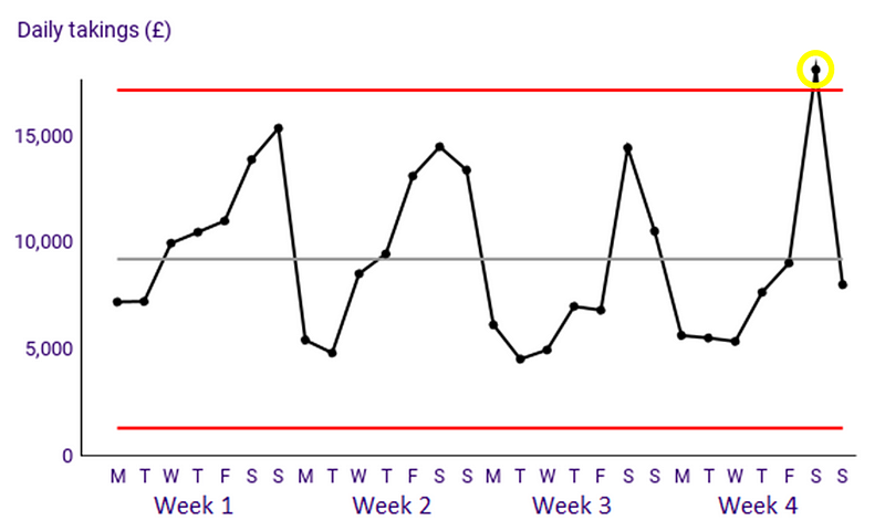
Deming Alliance — Process Behaviour Charts — An Introduction
If we bring these ideas together, an effective Product Operations department that is focusing on insights and data should be all about distinguishing signal from noise. If you aren’t familiar with the term, signal is what you should be looking at, this is the meaningful information you want to focus on, after all, the clue is in the name! Noise is all the random variation that interferes with it. If you want to learn more, the book The Signal and The Noise is another great resource to aid your learning around this topic. Unfortunately, too often in organisations when we work with data people wrongly misinterpret that which is noise to in fact be signal. For Product Operations to be adding value, we need to be pointing our Product teams to signals and cutting out the noise in typical metrics we track.
But what good is theory without practical application?
An example
Let’s take a look at four user/customer related metrics for an eCommerce site from the beginning of December up until Christmas last year:
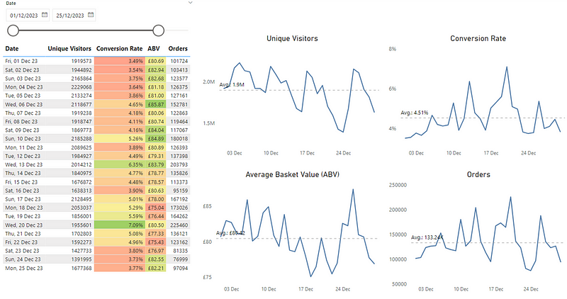
The use of colour in the table draws the viewer to this information as it is highlighted. What then ends up happening is a supporting narrative something like so, which typically comes from those monitoring the numbers:
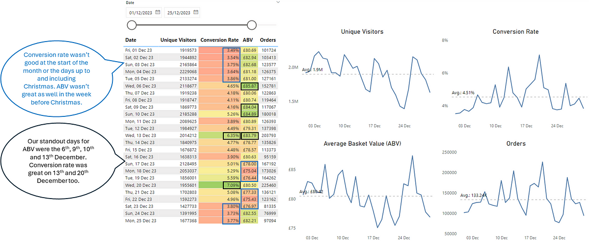
The problem here is that noise (expected variation in data) is being mistaken for signal (exceptional variation we need to investigate), particularly as it is influenced through the use of colour (specifically the RAG scale). The metrics of Unique Visitors and Orders contain no use of colour so there’s no way to determine what, if anything, we should be looking at. Finally, our line charts don’t really tell us anything other than if values are above/below average and potentially trending.
A Product Operations team shows value-add in enabling the organisation be more effective in spotting opportunities and/or significant events that others may not see. If you’re a PM working on a new initiative/feature/experiment, you want to know if there are any shifts in the key metrics you’re looking at. Visualising it in this ‘generic’ way doesn’t allow us to see that or, could in fact be creating a narrative that isn’t true. This is where PBCs can help us. They can highlight where we’re seeing exceptional variation in our data.
Coming back to our original example, let’s redesign our line chart to be a PBC and make better usage of colour to highlight large changes in our metrics:
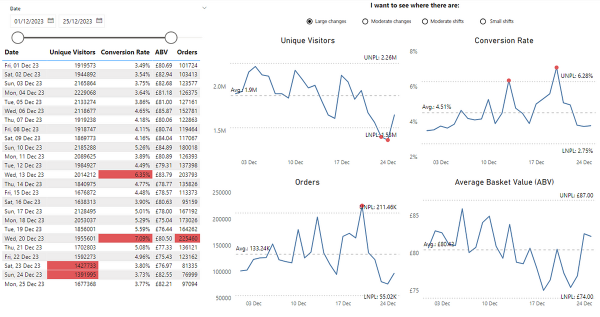
We can see that we weren’t ‘completely’ wrong, although we have missed out a lot more useful information. We can see that Conversion Rate for the 13th and 20th December was in fact exceptional variation from the norm, so the colour highlighting of this did make sense. However, the narrative around Conversion Rate performing badly at the start of the month (with the red background in the cells in our original table) as well as up to and including Christmas is not true, as this was just routine variation that was within values we expected.
For ABV we can also see that there was no significant event up to and including Christmas, so it neither performed ‘well’ or ‘not so well’ as the values every day were within our expected variation. What is interesting is that we can see we have dates where we have seen exceptional variation in both our Orders and Unique Visitors, which should prompt further investigation. I say further investigation as these charts, like nearly all data visualisation doesn’t give you answers, it just gets you asking better questions. It’s worth noting that for certain events (e.g. Black Friday) these may appear as ‘signal’ in your data but in fact it’s pretty obvious as to the cause.
Exceptional variation in terms of identifying those significant events isn’t the only usage for PBCs. We can use these to spot other, more subtle changes in data. Instead of large changes we can also look at moderate changes. These draw attention to patterns inside ‘noisy’ data that you might want to investigate (of course after you’ve checked out those exceptional variation values). For simplicity, this happens when two out of three points in a row are noticeably higher than usual (above a certain threshold not shown in these charts). This can provide new insight that wasn’t seen previously, such as our metrics of Unique Visitors and Orders, which previously had no ‘signal’ to consider:
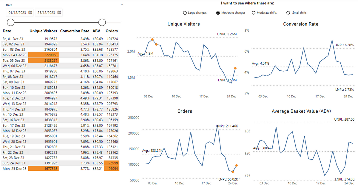
Now we can see points where there has been a moderate change. We can then start to ask questions such as could this be down to a new feature, a marketing campaign or promotional event? Have we improved our SEO? Were we running an A/B test? Or is it simply just random fluctuation?
Another use of PBCs centre on sustained shifts which, when you’re working in the world of product management is a valuable data point to have at your disposal. To be effective at building products, we have to focus on outcomes. Outcomes are a measurable change in behaviour. A measurable change in behaviour usually means a sustained (rather than one-off) shift. In PBCs, moderate, sustained shifts indicate a consistent change which, when analysing user behaviour data means a sustained change in the behaviour of people using/buying our product. This happens when four out of five points in a row are consistently higher than usual, based on a specific threshold (not shown in these charts). We can now see where we’ve had moderate, sustained shifts in our metrics:
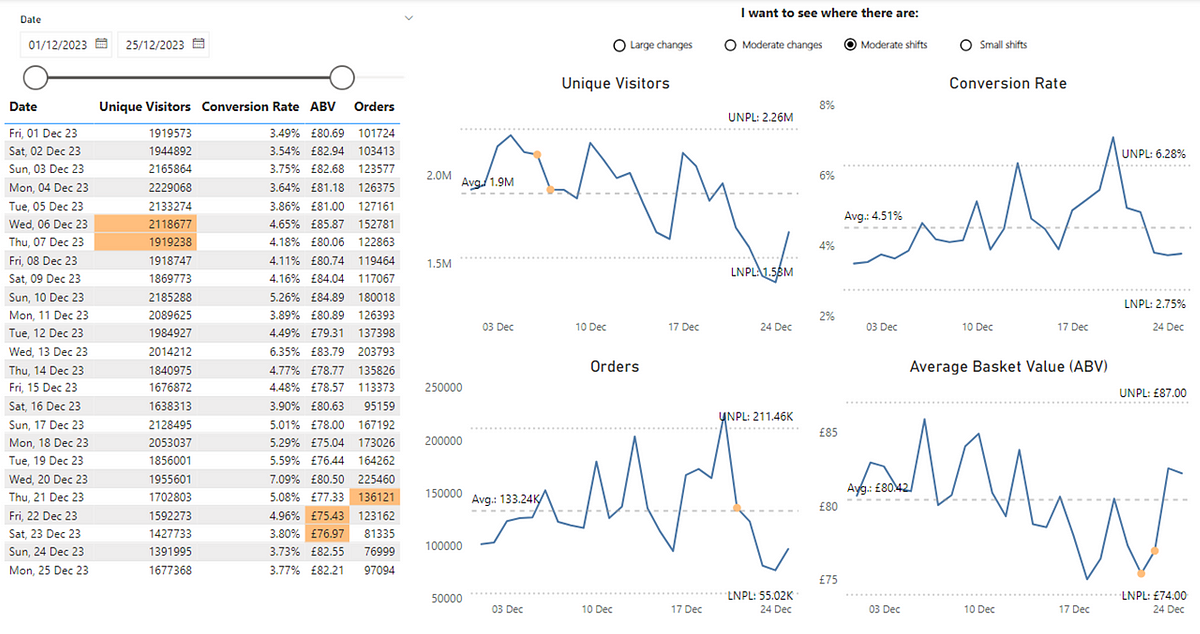
Again we don’t know what the cause of this is but, it focuses our attention on what we have been doing around those dates. Particularly for our ABV metricwe might want to reconsider our approach given the sustained change that appears to be on the wrong side of the average.
The final sustained change focus on smaller, sustained changes. This is a run of at least 8 successive data points within the process limits on the same side of the average line (which could be above or below):
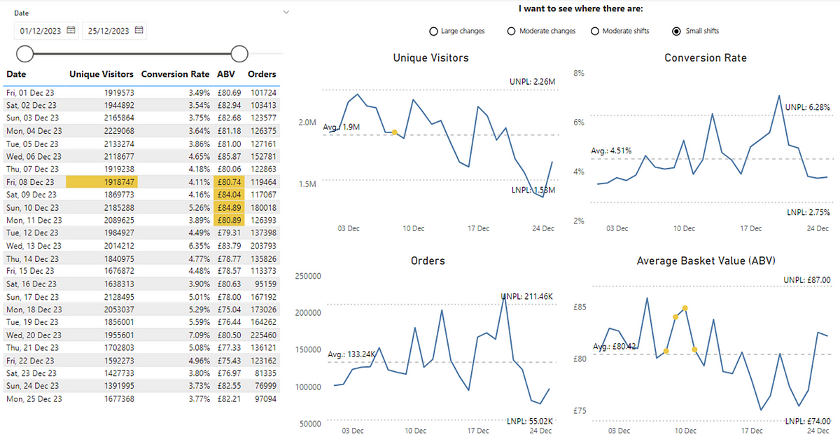
For our example here, we’re seeing this for Unique Visitors, which is good as we’re seeing a small, sustained change in the website’s traffic above the average. Even clearer is for ABV, with multiple points above the average indicating a positive (but small) shift in customer purchasing behaviour.
Key Takeaways
Hopefully, this blog provides some insight into how PBCs enable Product Operations to support data-driven decisions while avoiding common data pitfalls. By separating signal from noise, organisations can prevent costly errors like unnecessary resource allocation, misaligned strategies, or failing to act on genuine opportunities. In a data-rich world, PBCs are not just a tool for insights — they’re a safeguard against the financial and operational risks of misinterpreting data.

In terms of getting started, consider any of the metrics you look at now (or provide the organisation) as a Product Operations team. Think about how you differentiate signal from noise. What’s the story behind your data? Where should people be drawn to? How do we know when there are exceptional events or subtle shifts in our user behaviour? If you can’t easily tell or have different interpretations, then give PBCs a shot. As you grow more confident, you’ll find PBCs an invaluable tool in making sense of your data and driving product success.
If you’re interested in learning more about them, check out Wheeler’s book (I picked up mine for ~£10 on eBay) or if you’re after a shorter (and free!) way to learn as well as how to set them up with the underlying maths, check out the Deming Alliance as well as this blog from Tom Geraghty on the history of PBCs.
