Agility

Adding Work Item Age to your Jira issues using Power Automate

A guide on how you can automate adding the flow metric of Work Item Age directly into your issues in Jira using Power Automate…

Context

As teams increase their curiosity around their flow of work, making this information as readily available to them is paramount. Flow metrics are the clear go-to as they provide great insights around predictability, responsiveness and just how sustainable a pace a team is working at. There is however, a challenge with getting teams to frequently use them. Whilst using them in a retrospective (say looking at outliers on a cycle time scatter plot) is a common practice, it is a lot harder trying to embed this into their every day conversations. There is no doubt these charts add great value but, plenty of teams forget about them in their daily sync/scrums as they will (more often than not) be focused on sharing their Kanban board. They will focus on discussing the items on the board, rather than using a flow metrics chart or dashboard, when it comes to planning for their day. As an Agile Coach, no matter how often I show it and stress the importance of it, plenty of teams that I work with still forget about the “secret sauce” of Work Item Age in their daily sync/scrum as it sits on a different URL/tool.

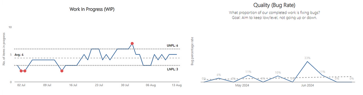
Example Work Item Age chart

This got me thinking about how to might overcome this and remove a ‘barrier to entry’ around flow. Thankfully, automation tools can help. We can use tools like Power Automate, combined with Jira’s REST API, to help improve the way teams work through making flow data visible…

Prerequisites

There are a few assumptions made in this series of posts:

With all those in place — let’s get started!

Adding a Work Item Age field in Jira

The first thing we need to do is add a custom field for Work Item Age. To do this, navigate to your Jira project you want to add this in. Click on ‘Project settings’ then choose a respective issue type (in this case we’re just choosing Story to keep it simple). Choose ‘Number’ and give the field the name of Work Item Age (Days) and add the description of what this is:

Once done, click ‘Save Changes’. If you want to add it for any other issue types, be sure to do so.

Finding out the name of this field

This is one of the trickier parts of this setup. When using the Jira REST API, custom fields do not give any indication as to what they refer to in their naming, simply going by ‘CustomField_12345’. So we have to figure out what our custom field for work item age is.

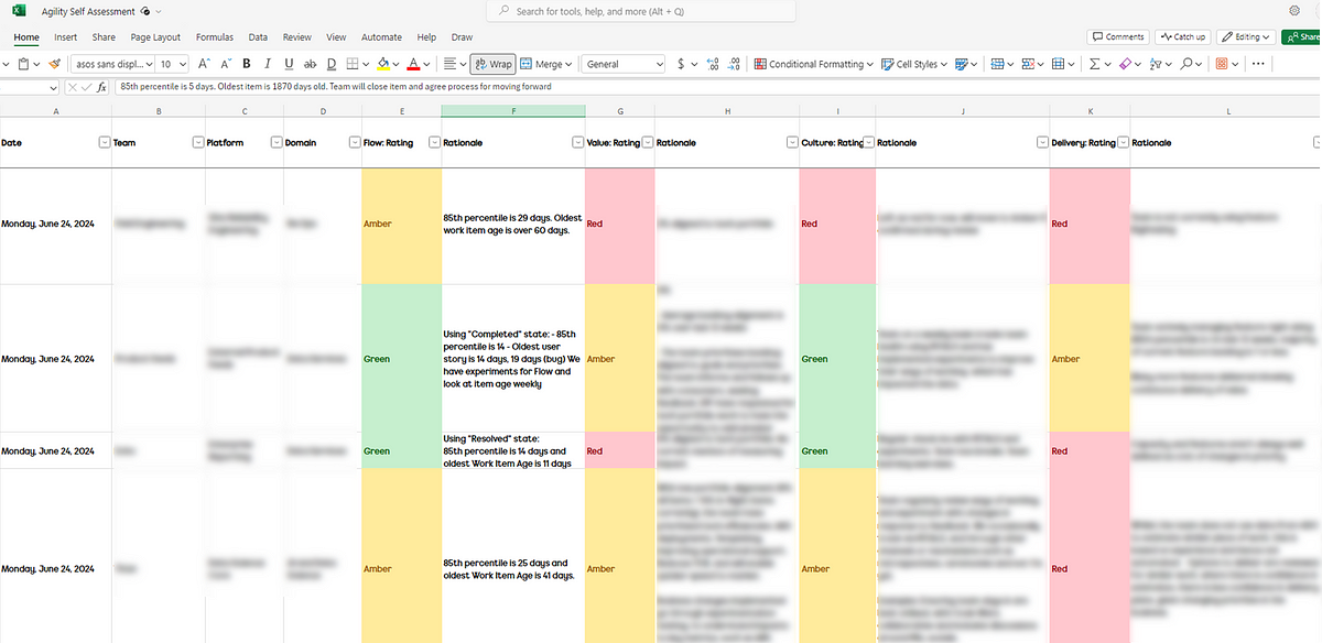
To do so, (edit: after posting, Caidyrn Roder pointed me to this article) populate a dummy item with a unique work item age, like I have done here with the value 1111:

Next, use the API to query that specific item and do a CTRL + F till you find that value, it will look similar to the below, just change the parts I’ve indicated you need to replace:

https://[ReplaceWithYourJiraInstanceName].atlassian.net/rest/api/2/search?jql=key%20%3D%20[ReplaceWithTheKeyOfTheItem]

My example is:
https://nickbtest.atlassian.net/rest/api/2/search?jql=key%20%3D%20ZZZSYN-38

Which we can do a quick CTRL + F for this value:

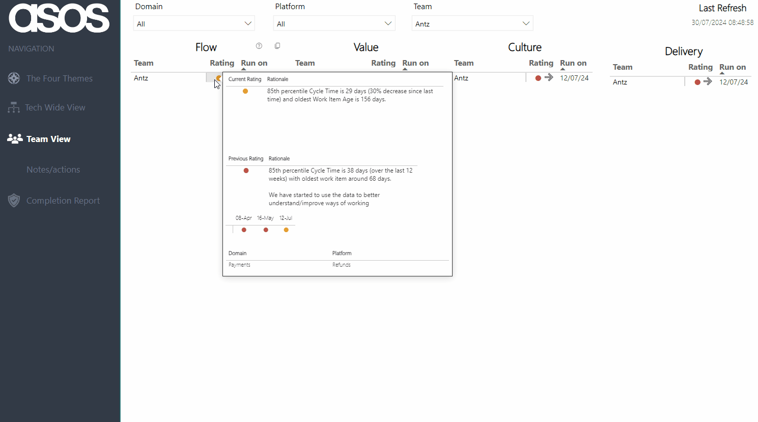
We can see that our Work Item Age field is called — customfield_12259. This will be different for you in your Jira instance! Once you have it, note it down as we’re going to need it later…

Understanding how Work Item Age is to be calculated

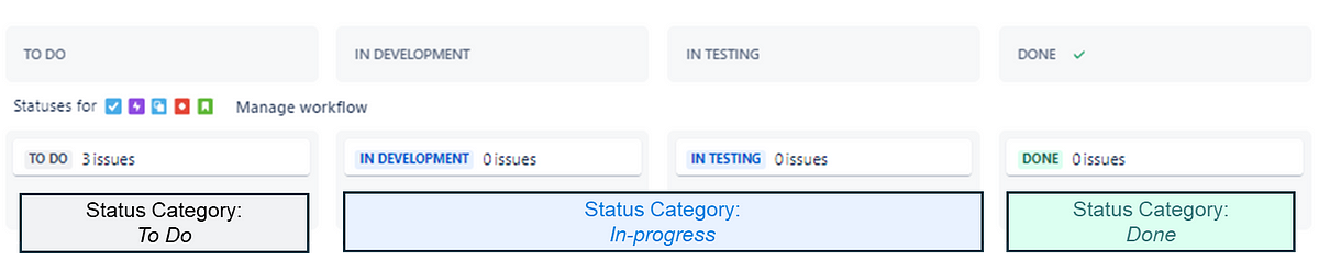
When it comes to Jira, you have statuses that are respective to a particular workflow. These will be statuses items move through and also map to columns on your board. Status categories are something not many folks are aware of. These are essentially ‘containers’ for where statuses sit. Thankfully, there are only three — To do, In Progress and Done. These are visible when adding statuses in your workflow:

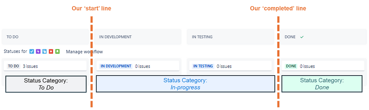
An easier to understand visual representation of it on a kanban board would be:

What’s also helpful is that Jira doesn’t just create a timestamp when an item changes Status, it also does it when it changes Status Category. Therefore we can use this to relatively easily figure out our Work Item Age. Work Item Age is ‘the amount of elapsed time between when a work item started and the current time’. We can think of ‘started’ as being the equivalent to when an item moved ‘In Progress’ — we can thus use our StatusCategoryChangedDate as our start time, the key thing that we need to calculate Work Item Age:

Automating Work Item Age

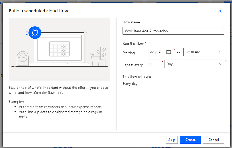
First we need to setup the schedule for our flow to run. To do this you would navigate to Power Automate and create a ‘Scheduled cloud flow’:

The timing of this is entirely up to you but my tip would be to do be before the daily stand-up/sync. Once you’re happy with it give it a name and click ‘Create’:

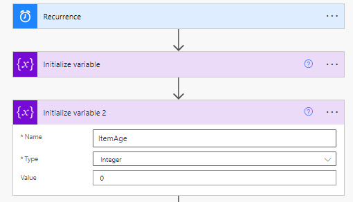
Following this we are going to add a step to Initialize variable — this is essentially where we will ‘store’ what our Issue Key is in a format that Power Automate needs it to be in (an array) with a value of ‘[]’:

We are then going to add the Initialize variable step again— this time so we ‘store’ what our Work Item Age is which, to start with, will be an integer with a value of 0:

After this, we’re going to add a HTTP step. This is where we are going to GET all our ‘In Progress’ issues and the date they first went ‘In Progress’, referred to in the API as the StatusCategoryChangedDate. You’ll also notice here I am filtering on the hierarchy level of story (hierarchy level = 0 in JQL world) — this is just for simplicity reasons and can be removed if you want to do this at multiple backlog hierarchy levels:

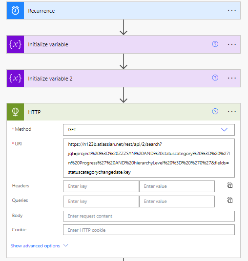
https://[ReplaceWithYourJiraInstanceName].atlassian.net/rest/api/2/search?jql=project%20%3D%20[ReplaceWithYourJiraProjectName]%20AND%20statuscategory%20%3D%20%27In%20Progress%27%20AND%20hierarchyLevel%20%3D%20%270%27&fields=statuscategorychangedate,key My example: https://n123b.atlassian.net/rest/api/2/search?jql=project%20%3D%20ZZZSYN%20AND%20statuscategory%20%3D%20%27In%20Progress%27%20AND%20hierarchyLevel%20%3D%20%270%27&fields=statuscategorychangedate,key

You will then need to click ‘Show advanced options’ to add in your API token details. Set the authentication to ‘Basic’, add in the username of the email address associated with your Jira instance and paste your API token into the password field:

Then we will add a PARSE JSON step to format the response. Choose ‘body’ as the content and add a schema like so:
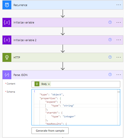
{
    "type": "object",
    "properties": {
        "expand": {
            "type": "string"
        },
        "startAt": {
            "type": "integer"
        },
        "maxResults": {
            "type": "integer"
        },
        "total": {
            "type": "integer"
        },
        "issues": {
            "type": "array",
            "items": {
                "type": "object",
                "properties": {
                    "expand": {
                        "type": "string"
                    },
                    "id": {
                        "type": "string"
                    },
                    "self": {
                        "type": "string"
                    },
                    "key": {
                        "type": "string"
                    },
                    "fields": {
                        "type": "object",
                        "properties": {
                            "statuscategorychangedate": {
                                "type": "string"
                            }
                        }
                    }
                },
                "required": [
                    "expand",
                    "id",
                    "self",
                    "key",
                    "fields"
                ]
            }
        }
    }
}

Then we need to add an Apply to each step and select the ‘issues’ value from our previous PARSE JSON step:

Then we’re going to add a Compose action — this is where we’ll calculate the Work Item Age based on todays date and the StatusCategoryChangedDate, which is done as an expression:

div(sub(ticks(utcNow()), ticks(items('Apply_to_each')?['fields']?['statuscategorychangedate'])), 864000000000)

Next we’ll add a Set Variable action to use the dynamic content outputs from the previous step for our ItemAge variable:

Then add an Append to array variable action where we’re going to append ‘key’ to our ‘KeysArray’:

Then we’ll add another Compose action where we’ll include our new KeysArray:

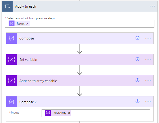
Then we’re going to add another Apply to each step with the outputs of our second compose as the starting point:

Then we’re going to choose the Jira Edit Issue (V2) action which we will populate with our Jira Instance (choose ‘Custom’ then just copy/paste it in), ‘key’ from our apply to each step in the Issue ID or Key field and then finally in our ‘fields’ we will add the following:

Where ItemAge is your variable from the previous steps.

Once that is done, your flow is ready — click ‘Save’ and give it a test. You will be able to see in the flow run history if it has successfully completed.

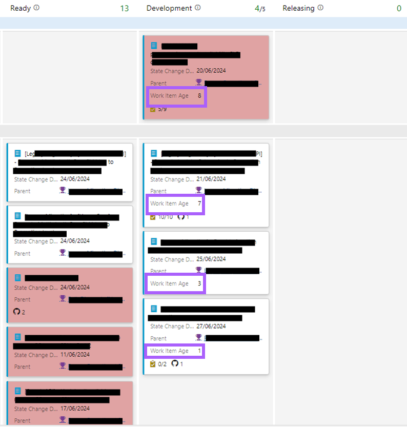
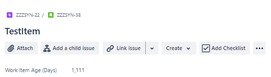
Then you should have the Work Item Age visible on the issue page:

Depending on your Jira setup, you could then configure the kanban board to also display this:

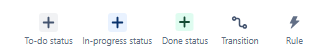
Finally, we want to make sure that the work item age field is cleared any time an item moves to ‘Done’ (or whatever your done statuses are). To do this go to the Project Settings > Automation then setup a rule like so:

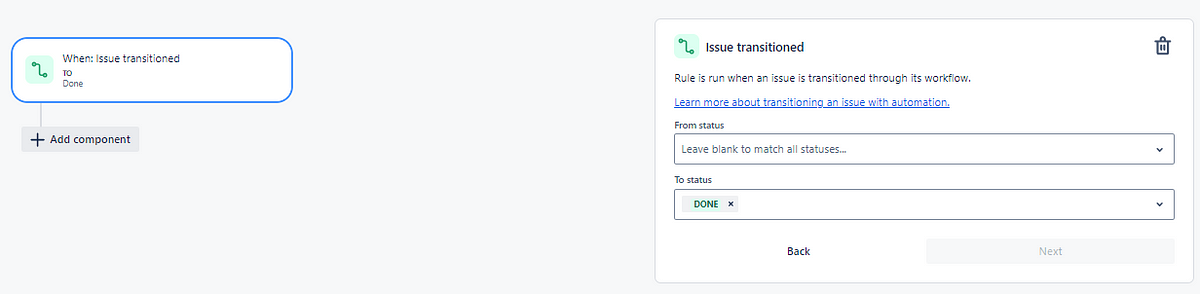
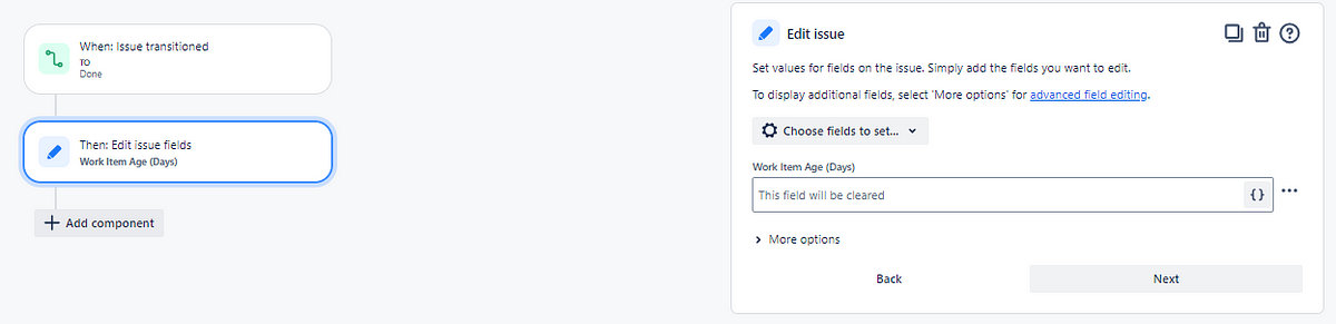
That way Work Item Age will no longer be populated for completed items, as they are no longer ‘in progress’.

Hopefully this is a useful starting point for increasing awareness of Work Item Age on issues/the Jira board for your team :)

Flow, value, culture, delivery — measuring agility at ASOS (part 2)

The second in a two-part series where we share how at ASOS we are measuring agility across our teams and the wider tech organisation…

Recap on part one

For those who didn’t get a chance to read part one, previously I introduced our holistic measurement to agility, covering four themes of:

  • Flow — the movement of work through a teams workflow/board.

  • Value — the outcomes/impact in what we do and alignment with the goals and priorities of the organisation.

  • Culture — the mindset/behaviours we expect around teamwork, learning and continuous improvement.

  • Delivery — the practices we expect that account for the delivery of Epics/Features, considering both uncertainty and complexity.

Now let’s get to explaining how the results are submitted/visualized, what the rollout/adoption has been like along with our learnings and future direction.

Submitting the results

We advise teams to submit a new assessment every six to eight weeks, as experience tells us this gives enough time to see the change in a particular theme. When teams are ready to submit, they go to an online Excel form and add a new row, then add the rating and rationale for each theme:

A screenshot of a spreadsheet showing how users enter submissions

Excel online file for capturing ratings and rationale for each theme

Visualizing the results

Team view

By default, all teams and their current rating/trend, along with the date when the last assessment was run are visible upon opening the report:

A screenshot of all the team self-assessment results on one page

Note: all Team/Platform/Domain names anonymised for the purposes of this blog!

Viewers can then filter to view their team — hovering on the current rating provides the rationale as well as the previous rating and rationale. There is also a history of all the submitted ratings for the chosen theme over time:

An animation showing the user filtering on the report for a specific team

Note: all Team/Platform/Domain names anonymised for the purposes of this blog!

Filters persist across pages, so after filtering you can also then click through to the Notes/Actions page to remind yourself of what your team has identified as the thing to focus on improving:

An animation showing the user who has filtered on a team then viewing the improvement actions a team has documented

Note: all Team/Platform/Domain names anonymised for the purposes of this blog!

Platform/Domain view

Normally, we facilitate a regular discussion at ‘team of teams’ level which, depending on the size of an area, may be a number of teams in a platform or all the teams and platforms in a Domain:

A screenshot showing the self-assessment results for a particular platform

Note: all Team/Platform/Domain names anonymised for the purposes of this blog!

This helps leaders in an area understand where the collective is at, as well as being able to focus on a particular team. It also can highlight where teams in an area learn from each other, rather than just relying on an Agile Coach to advise. Again filtering persists to allow for Leaders to have a holistic view of improvements across teams:

A screenshot showing the improvement actions for a particular platform

Note: all Team/Platform/Domain names anonymised for the purposes of this blog!

This is key for leaders as it informs them in understanding how they can support an environment towards continuous improvement and agility. For example if a team was experimenting with WIP limits to improve their rating for Flow, if a leader is pushing more work to them then this probably isn’t going to result in the theme improving!

Tech Wide View

The Tech Wide View provides an overview of the most recent submissions for all teams across the organisation. We feel this gives us the clearest ‘measurement’ and holistic view of agility in our tech organisation, with the ability to hover on a specific theme to see if ratings are improving:

An animation show the tech wide view of results for the four themes and the trend

As coaches, this also helps inform us as to what practices/coaching areas we should be focusing on at scale, rather than trying to go after everything and/or focusing on just a specific team.

In turn we can use this data to help inform things like our own Objectives and Key Results (OKRs). We use this data to guide us on what we should be focusing on and, more importantly, if we are having impact:

A screenshot showing the OKRs for the Agile Coaching team and how they use the data from the self-assessment in their key results

Rollout, adoption and impact

In rolling this out, we were keen to stick to our principles and invite teams to complete this, rather than mandating (i.e. inflicting) it across all of our technology organisation. We used various channels (sharing directly with teams, presenting in Engineering All Hands, etc.) to advertise and market it, as well as having clear documentation around the assessment and the time commitment needed. After launching in Jan, this is the rate at which teams have submitted their first assessment:

In addition to this, we use our internal Team Designer app (more on this here) to cross-reference our coverage across domains and platforms. This allows us to see in which areas adoption is good and in which areas we need to remind/encourage folks around trialling it:

A screenshot of the Team Designer tool showing the percentage of teams in a platform/domain that have completed a self-assessment

Note: numbers may not match due to date screenshots were taken!

With any ‘product’, it’s important to consider what are appropriate product metrics to consider, particularly as we know measurable changes in behaviour from users are typically what correlate with value. One of the ways to validate if the self-assessment is adding value for teams is if they continue to use it. One-off usage may give them some insight but if it doesn’t add value, particularly with something they are ‘invited’ to use, then it will gradually die and we won’t see teams continue to complete it. Thankfully, this wasn’t the case here, as we can see that 89% of teams (70 out of 79) have submitted more than one self-assessment:

The main thing though that we are concerned with in demonstrating the impact/value of this approach is if teams are actually improving. You could still have plenty of teams adopt the self-assessment yet stay the same for every rating and never actually improve. Here we visualise each time a team has seen an improvement between assessments (note: teams are only counted the first time they improve, not counted again if they improve further):

Overall we can see the underlying story is that the vast majority of teams are improving, specifically that 83% of teams (58 out of 70) who have submitted >1 assessment have improved in one (or more) theme.

Learnings along the way

Invitation over infliction

In order to change anything around ways of working in an organisation, teams have to want to change or “opt-in”. Producing an approach without the acceptance going in that you may be completely wrong and being prepared to ditch it leads to sunk cost fallacy. It is therefore important with something like this that teams can “opt-out” at any time.

Keep it lightweight yet clear

There are many agility assessments that we have seen in different organisations/the industry over the years and almost always these fall foul of not being lightweight. You do not need to ask a team 20 questions to “find out” about their agility. Having said this, lightweight is not an excuse for lack of clarity, therefore supporting documentation on how people can find out where they are or what the themes mean is a necessity. We used a Confluence page with some fast-click links to specific content to allow people to quickly get to what they needed to get to:

A screenshot showing a Confluence wiki with quick links

Shared sessions and cadence

Another way to increase adoption is to have teams review the results together, rather than just getting them to submit and then that’s it. In many areas we, as coaches, would facilitate a regular self-assessment review for a platform or domain. In this each team would talk through their rationale for a rating whilst the others can listen in and ask questions/give ideas on how to improve. There have been times for example when ratings have been upgraded due to teams feeling they were being too harsh (which surprisingly I also agreed with!) but the majority of time there are suggestions they can make to each other. In terms of continuous improvement and learning this is way more impactful than hearing it from just an Agile Coach.

Set a high bar

One of the observations we made when rolling this out was how little ‘green’ there was in particular themes. This does not automatically equate to teams being ‘bad’, more just they are where we think good is from an agility perspective, relevant to our experience and industry trends.

One of the hard parts with this is not compromising in your view of what good looks like, even though it may not be a message that people particular like. We leaned heavily on the experience of Scott Frampton and his work at ASOS to stay true to this, even if it at times it made for uncomfortable viewing.

Make improvements visible

Initially, the spreadsheet did not contain the column about what teams are going to do differently as a result of this, it was only after a brief chat with Scott and with his learnings we implemented this. Whilst it does rely on teams to add in the detail about what they are going to do differently, it helps see that teams are identifying clear action to take, based on the results of the assessment.

Culture trumps all when it comes to improvement

This is one of the most important things when it comes to this type of approach. One idea I discussed with Dan Dickinson from our team was around a ‘most improved’ team, where a team had improved the most from their initial assessment to what they are now. In doing this one team was a clear standout, yet they remained at a value of ‘red’ for culture. This isn’t the type of team we should be celebrating, even if all the other factors have improved. Speedy delivery of valuable work with good rigour around delivery practices is ultimately pointless if people hate being in that team. All factors to the assessment are important but ultimately, you should never neglect culture.

Measure it’s impact

Finally, focus on impact. You can have lots of teams regularly assessing but ultimately, if it isn’t improving the way they work it is wasted effort. Always consider how you will validate that something like an assessment can demonstrate tangible improvements to the organisation.

What does the future hold?

As a coaching team we have a quarterly cadence of reviewing and tweaking the themes and their levels, sharing this with teams when any changes are made:

A screenshot of a Confluence page showing change history for the self-assessment

Currently, we feel that we have the right balance in the number of themes vs. the light-weightiness of the self-assessment. We have metrics/tools that could bring in other factors, such as predictability and/or quality:

A screenshot showing a Process Behaviour Chart (PBC) for work in progress and a chart showing the rate of bug completion for a team

Left — a process behaviour chart highlighting where WIP has become unpredictable | Right — a chart showing the % of Throughput which are Bugs which could be a proxy for ‘quality’

Right now we’ll continue the small tweaks each quarter with an aim to improve as many teams, platforms and domains as we can over the next 12 months…watch this space!

Flow, value, culture, delivery — measuring agility at ASOS.com (part 1)

The first in a two-part series where we share how at ASOS we are measuring agility across our teams and the wider tech organisation. This part covers the problems we were looking to solve, what the themes are, as well as exploring the four themes in detail…

Context and purpose

As a team of three coaches with ~100 teams, understanding where to spend our efforts is essential to be effective in our role. Similarly, one of our main reasons to exist in ASOS is to help understand the agility of the organisation and clearly define ‘what good looks like’.

Measuring the agility of a team (and then doing this at scale) is a difficult task and in lots of organisations this is done through the usage of a maturity model. Whilst maturity models can provide a structured framework, they often fall short in addressing the unique dynamics of each organisation, amongst many other reasons. The rigidity of these models can lead to a checklist mentality, where the focus is on ticking boxes (i.e. ‘agile compliance’) rather than fostering genuine agility. Similarly they assume everyone follows the same path where we know context differs.

Such as this…

Unfortunately, we also found we had teams at ASOS that were focusing on the wrong things when it comes to agility such as:

  • Planned vs. actual items per sprint (say-do ratio)

  • How many items ‘spill over’ to the next sprint

  • How many story points they complete / what’s our velocity / what is an “8-point story” etc.

  • Do we follow all the agile ceremonies/events correctly

When it comes to agility, these things do not matter.

We therefore set about developing something that would allow our teams to self-assess, which focuses on the outcomes agility should lead to. With the main problems to solve being:

  • Aligning ASOS Tech on a common understanding of what agility is

  • Giving teams a lightweight approach to self-assess, rather than relying on Agile Coaches to observe and “tell them” how agile they are

  • Having an approach that is more up to date with industry trends, rather than how people were taught Scrum/Kanban 5, 10 or 15+ years ago

  • Having an approach to self-assessment that is framework agnostic yet considers our ASOS context

  • Allowing senior leaders to be more informed about where their teams are agility wise

Our overarching principle being that this is a tool to inform our collective efforts towards continuous improvement, and not a tool to compare teams, nor to be used as a stick to beat them with.

The Four Themes

In the spirit of being lightweight, we restricted ourself to just four themes, these being things that we think are most important for teams when it comes to the outcomes you should care about when it comes to your way of working.

  • Flow — the movement of work through a teams workflow/board.

  • Value — focusing on the outcomes/impact of what we do and alignment with the goals and priorities of the organisation.

  • Culture — the mindset/behaviours we expect around teamwork, learning and continuous improvement.

  • Delivery— the practices we expect that account for the delivery of features and epics, considering both uncertainty and complexity.

Each theme has three levels, which are rated on a Red/Amber/Green scale — mainly due to this being an existing scale of self-assessment in other tools our engineering teams have at their disposal.

Flow

The focus here is around flow metrics, specifically Cycle Time and Work Item Age, with the three levels being:

Teams already have flow metrics available to them via a Power BI app, so are able to quickly navigate and understand where they are:

The goal with this is to make teams aware just how long items are taking, as well as how long the “in-flight” items have actually been in progress. The teams that are Green are naturally just very good at breaking work down, and/or have already embedded looking at this on a regular basis into their way of working (say in retrospectives). Those teams that are at Red/Amber have since adopted techniques such as automating the age of items on the kanban board to highlight aging items which need attention:

Value

The focus with this theme is understanding the impact of what we do and ensuring that we retain alignment with the goals and priorities of the organisation:

In case you haven’t read it, in the ASOS Tech blog previously I’ve covered how we go about measuring portfolio alignment in teams. It essentially is looking at how much of a team backlog goes from PBI/User Story > Feature > Epic > Portfolio Epic. We visualise this in a line chart, where teams can see the trend as well as flipping between viewing their whole backlog vs. just in-flight work:

Similar to flow metrics, teams can quickly access the Power BI app to understand where they are for one part of value:

The second part is where many teams currently face a challenge. Understanding the impact (value) of what you deliver is essential for any organisation that truly cares about agility. We’re all familiar with feature factories, so this was a deliberate step change to get our teams away from that thinking. What teams deliver/provide support for varies, from customer facing apps to internal business unit apps and even tools or components that other teams consume, so having a ‘central location’ for looking at adoption/usage metrics is impossible. This means it can take time as either data is not readily available to teams or they had not actually really considered this themselves, most likely due to being a component part of a wider deliverable.

Still, we’ve seen good successes here, such as our AI teams who measure the impact of models they build around personalised recommendations, looking at reach and engagement. Obviously for our Web and Apps teams we have customer engagement/usage data, but we also have many teams who serve other teams/internal users, like our Data teams who look at impact in terms of report open rate and viewers/views of reports they build:

Culture

Next we look at the behaviours/interactions a team has around working together and continuously improving:

Ultimately, we’re trying to get away from the idea that many have around agility that continuous improvement = having retrospectives. These are meaningless if they are not identifying actionable (and measurable) improvements to your way of working, no matter how “fun” it is to do a barbie themed format!

We aren’t prescriptive in what team health tool teams use, so long as they are doing it. This could be our internal tool, PETALS (more on this here), the well known Spotify Team/Squad Health Check or even the Team Assessment built into the retrospectives tool in Azure DevOps:

All tools welcome!

The point is that our good teams are regularly tracking this and seeing if it is getting better.

A good example of what we are looking for at ‘green’ level is from this team who recently moved to pairing (shout out to Doug Idle and his team). Around 8 weeks before this image was taken they moved to pairing, which has not only made them happier as a team, but has clearly had a measurable impact in reducing their 85th percentile cycle time by 73%:

73% reduction (from 99 to 27 days) in 85th percentile Cycle Time as a result of pairing

Combine this with then sharing more widely, primarily so teams can learn from each other, then this is what we are after in our strongest teams culturally.

Delivery

The final theme touches on what many agile teams neglect which is ultimately about delivering. When we mean delivery in this context we’re focusing on delivery of Features/Epics (as opposed to PBI/Story level). Specifically, we believe it’s understanding risk/uncertainty and striving towards predictability and what this means when using agile principles and practices:

The good teams in this theme understand that due to software development being complex, you need to forecast delivery with a percentage confidence, and do this regularly. This means using data which, for our teams is available to them within a few clicks, here they can forecast, given a count of items when will they be done or, given a time box, what can they deliver.

Many teams have multiple features in their backlog, thus to get to ‘green’ our teams should leverage Feature Monte Carlo so the range of outcomes that could occur for multiple Features is visible:

Note: Feature list is fictional/not from any actual teams

Previously I’ve covered our approach to capacity planning and right-sizing, where teams focus on making Features no bigger than a certain size (batch) and thus can quickly (in seconds) forecast the amount of right-sized features they have capacity for, which again is what we look for in our ‘green’ criteria:

Note: Feature list is fictional/not from any actual teams

The best way to do this really is to have a regular cadence where you specifically look at delivery and these particular metrics, that way you’re informed around your progress and any items that may need breaking down/splitting.

Part two…

In this post I share how teams submit their results (and at what cadence) as well as how the results are visualised, what the rollout/adoption has been like, along with our learnings and future direction for the self-assessment…