Ways of Working

ThoughtSpot and Blocked Work

The Importance of Being Blocked

Despite our best attempts at creating small, cross-functional and autonomous teams, being “blocked” is unfortunately still a common occurrence with many teams. There can be any number of reasons why work gets blocked — it could be internal to the team (e.g. waiting on Product Owner/Manager feedback, environments down, etc.), within the technology function/from other teams (e.g. platform outage) or even the wider organisation (e.g. waiting for risk, security, legal, etc.).

The original production of The Importance of Being Earnest in 1895…with a blocked lens

Source: Wikipedia

As mentioned in a previous post, flow metrics should be an essential aspect in the day to day interactions a high performing team has. They should also be leveraged as inputs into conversations with stakeholders, whether it’s them being interested in the product(s) the team is building and/or as members in the technology ecosystem in the organisation.

Unfortunately, when it comes to flow, measuring and quantifying blocked work is one of the biggest blind spots teams have. Most teams probably don’t have a consensus on what being blocked means — As Dan Vacanti and Prateek Singh mentioned in their video on Flow Efficiency, most teams don’t even have an agreement on a definition of what blocked is!

Source:

https://stefan-willuda.medium.com/being-blocked-it-s-not-what-you-might-think-f8b3ad47e806

Blocked work is probably one of the most valuable data insights at your disposal as a team and organisation. These are the real things that are actually slowing you down, and likely the biggest impediments to flow that are in your in your way. As Jonathan Smart would say in Sooner Safer Happier:

Impediments are not in the path. Impediments ARE the path.

So how can we start to make this information visible and quantify the impact of our work being blocked? We use Blocked Work metrics.

Blocked Work Metrics

Here are four recommended metrics to look at when it comes to measuring the impact of work being blocked:

  • Current Blocked Items — items that are currently blocked and how long they have been blocked for.

  • Blocker Frequency — how frequently items become blocked, as well as a trend line showing if this is becoming more/less frequent over time.

  • Mean Time To Unblocked (MTTU)— how long (on average) does it take to unblock items, as well as a trend line to show if this is decreasing over time.

  • Days Lost to Being Blocked — how many days of an item’s total cycle time were spent being blocked (compared to not blocked).

Generating these in ThoughtSpot

As mentioned in previous posts, ThoughtSpot is what we use for generating insights on different aspects of work in Nationwide, one of the key products offered by our Measurement & Insight Accelerator. It produces ‘answers’ from our data which are then pinned to ‘pinboards’ for others to view. Our Product Owner Marc Price, supported by Zsolt Berend showcase this across the organisation, demonstrating how it aids conversations and learning, as opposed to a tool for senior leaders to brandish as a stick!

The Blocked Work Insights Pinboard is there as a pinboard for teams to ‘pull’ (rather than forced to use) — editing/filtering to be relevant to their context.
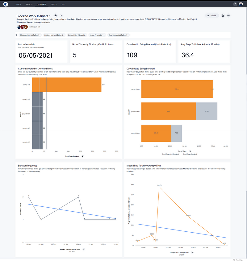
Using Blocked Work Insights

Current Blocked Items

This chart can be used as an input to your Daily Scrum. Discuss as a team on how to focus or swarm on unblocking these items over starting new work, particularly those that have been blocked for an extended period and/or may be closer to “Done” in your context.

Blocker Frequency
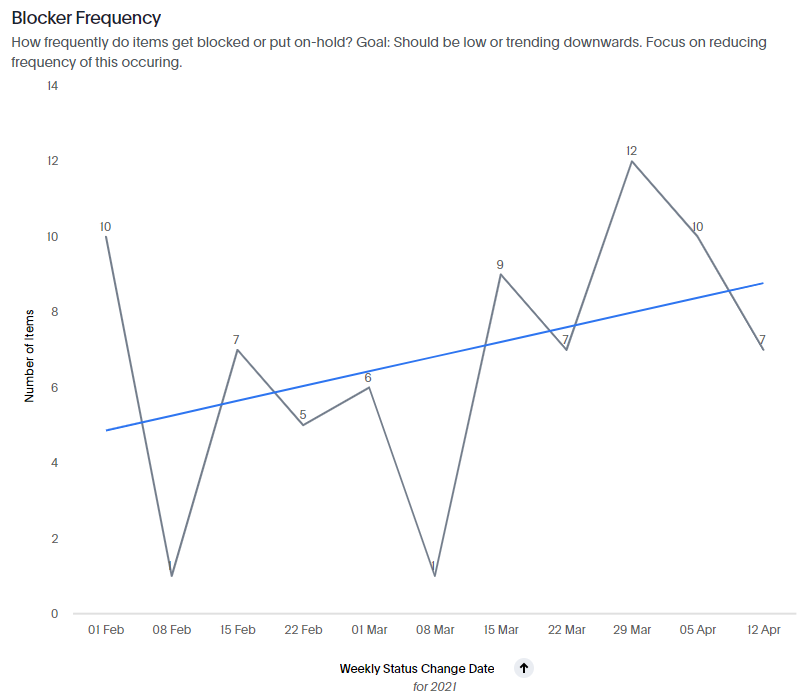
In using this chart, you should look at the trendline and the direction it’s heading, as well as the frequency of work being blocked. From a trend perspective it should be trending downwards or low and stable. If it’s trending in the wrong direction (upwards) then use this as an input into Retrospectives — potentially focusing on reducing dependencies the team faces.

Mean Time to Unblocked (MTTU)
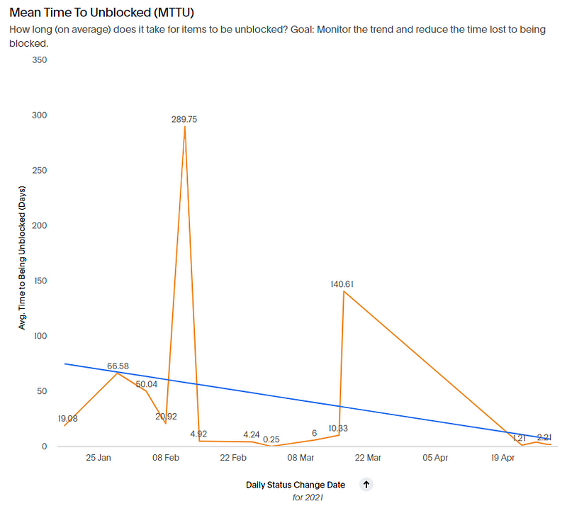
Use this chart to see how long it takes blockers to be resolved, as well as if this time to resolve is improving (trend line heading downward) or getting worse (trend line going upward) over time.

Days Lost to Being Blocked
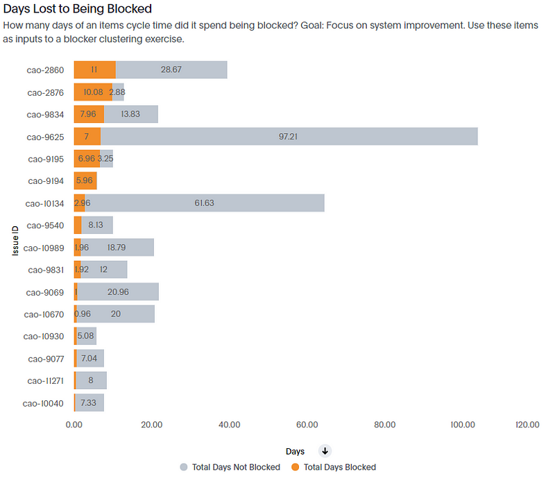
Use this chart to identify how much time is being lost due to work being blocked, potentially identifying themes around why items are blocked. You could use this as part of a a blocker clustering exercise in a retrospective. If you find the blockers are due to external factors, use it with senior leaders who can influence external change to show them the quantified impact teams are facing due to external bottlenecks.

Summary

To summarise, focusing on blocked work is data that is overlooked by most Agile teams. It shouldn’t be, as it will likely give you clear insight into where the bottlenecks are in achieving flow in your system, and the most impact with the improvements you identify. Teams should leverage data and metrics such as Current Blocked Items, Blocker Frequency, Blocked Vs. Unblocked and Time Lost to Being Blocked in order to take a data-driven approach to system-wide improvement.

For any Nationwide folks reading this who are curious about the impact of blocked work in their context, be sure to check out the Blocked Work Insights pinboard on our ThoughtSpot platform.

What metrics do you use for blocked work? Let me know in the replies :)

Product Metrics for Internal Teams

Disclaimer: this Post describes one way not the only way to
approach product metrics for internal teams

As our move from Project to Product gathers pace, it’s important that not only are we introducing a mindset shift and promoting different ways of working, but by doing so we also need to ensure that we are measuring things accordingly, as well as showcasing examples for others to help them on their journey. As Jon Smart points out, there is a tipping point in any approach to change where you start to cross the chasm, with people who are early/late majority wanting to see social proof of the new methods being implemented.

Screenshot 2020-06-05 at 09.38.17.png

I’ve noticed this becoming increasingly prevalent in training sessions and general coaching conversations, with the shift away from “what does this mean?” or “so who does that role?” to questions such as “so where are we in PwC doing this?” and “do you have a PwC example?”
These are trigger points that things are probably going well, as momentum is gathering and curiosity is growing, but it’s important that you have to hand specific examples in your context to gain buy-in. If you can’t provide ready-made examples from your own organisation then it’s likely your approach to new ways of working will only go so far.

This week I’ve been experimenting around with how we measure the impact and outcomes of one of the Products I’ve taken a Product Manager role on (#EatYourOwnDogFood). Team Health Check is a web app that allows teams to conduct anonymous health checks with regards to their ways of working, using it to identify experiments they want to run to improve areas, or identify trends around things that may or may not be working for them. Our first release of the app took place in December, with some teams adopting it.

Screenshot 2020-06-05 at 08.52.47.png

In a project model, that would be it and we’d be done, however we know that software being done is like lawn being mowed. If it’s a product, then it should be long-lived, in use and leading to better outcomes. So, with this in mind, we have to incorporate this when it comes to our product metrics we want to track.

Adoption & Usage

One of the first things to measure is adoption. I settled on three main metrics to track for this, the number of teams who have completed a team health check, adoption across different PwC territories and repeat usage by teams. 

Untitled.png

This way I can see what the adoption has been like in the UK, which is where I’m based and where it’s predominantly marketed, compared to other territories where I make people aware of it but don’t exactly exert myself in promoting it. The hypothesis being you’d expect to see mostly UK teams using it. I also then can get a sense as to the number of teams who have used it (to promote the continued investment in it) and see which teams are repeat users, which I would associate with them seeing the value in it.

Untitled2.png

Software Delivery Performance

We also want to look at technical metrics, as we want to see how we’re doing from a software delivery performance perspective. In my view, the best source for this are Software Delivery Performance metrics presented each year as part of the State of DevOps/DORA report.

I’m particularly biased towards these as they have been formulated through years of years with thousands of organisations and software professionals, with them proven directly correlate with different levels of software delivery performance. These are actually really hard to track! So I had to get a bit creative with them. For our app we have a specific task in our pipeline associated with a production deployment which thankfully has a timestamp in the Azure DevOps database, as well as a success/failure data point.
Using this we can determine two of those four metrics - Deployment Frequency (for your application how often do you deploy code to production or release it to end users) and Change Failure Rate (what percentage of changes to production or released to users result in degraded service and subsequently require remediation).

So looks like currently we’re a Medium-ish performer for Deployment Frequency / Elite performer in Change Failure Rate, which is ok for what the app is, its size and its purpose. It also prompts some questions around our changes, is our batch (deployment) size too big? Should we in fact be doing even smaller changes more frequently? If we did could that negatively impact change failure rate? How much would it impact it? All good, healthy questions informed by the data.

Feedback

Another important aspect to measure is feedback. The bottom section of the app has a simple Net Promoter Score style question for people completing the form, as well as an optional free text field to offer comments.

Screenshot 2020-06-05 at 09.19.31.png

Whilst the majority of people leave this blank, it has been useful in identifying themes for features people would like to see, which I do track in a separate page:

Screenshot (244).png

Looking at this actually informed our most recent May 20th release, as we revamped the UI, changing the banner image and radio button scale from three buttons to four, as well making the site mobile compatible.

Screenshot (246).png

I also visualise the NPS results, which proved for some interesting responses! I’d love to know what typical scores are for measuring NPS of software, but it’s fair to say it was a humbling experience once I gathered the results!

The point of course is that rather than viewing this as your failure, use it to inform what you do next and/or as a counter metric. For me, I’m pleased the adoption numbers are high, but clearly the NPS score shows we have work to do in making it a more enjoyable experience for people completing the form. Are there some hidden themes in the feedback? Are we missing something? Maybe we should do some user interviews? All good questions that the data has informed.

Screenshot (242).png

Cost

Finally we look at cost, which is of course extremely important. There are two elements to this, the cost of the people who build and support the software, and any associated cloud costs. At the moment we have an interim solution of an extract of peoples timesheets to give us the people costs per week, which I’ve tweaked for the purpose of this post with some dummy numbers. A gap we still have are the cloud costs, as I’m struggling to pull through the Azure costs into Power BI, but hopefully it’s just user error.

We can then use this to compare the cost vs all other aspects, justifying whether or not the software is worth the continued investment and/or meeting the needs of the organisation.

Overall the end result looks like this:

Screenshot (248).png

Like I said, this isn’t intended to be something prescriptive - more that it provides an example of how it can be done and how we are doing it in a particular context for a particular product.

Keen to hear the thoughts of others - what is missing? What would you like to see given the software and its purpose? Anything we should get rid of?
Leave your comments/feedback below.