With one more weekend till the UK starts to reopen and us starting to move back towards normality, I again used some free time over the weekend to scratch some creative itches when it comes to FlowViz.
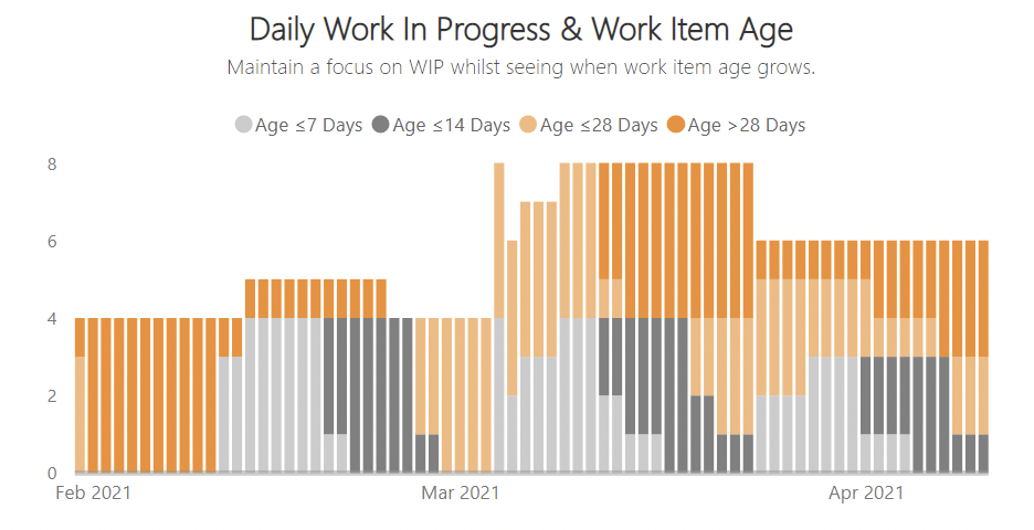
Daily Work In Progress & Work Item Age
Increasingly I’m learning more and more through the #DrunkAgile series that teams focusing on WIP alone is not enough. Work Item Age should increasingly play a part in the importance of teams process/workflow. I started to tackle this in the previous release however I started to think more about what could be done in the visuals within FlowViz. I’ve also long loathed the Agile community’s love of Cumulative Flow Diagrams (CFDs) - yes I know they can show you your bottlenecks and can be used as a learning aid with Little’s Law, but I’ve found through experience that they’re simply not practical. In the past five years I would say I’ve experienced a 10:1 ratio of people who don’t get CFDs versus people who encourage and advocate their usage. This felt like a good time to remove it from the template and focus on something better, something more insightful, creative and actionable.
I got most of the inspiration for this visual (like most things in the Agile Data/Metrics world!) from Troy Magennis. He’s used something very similar in his team dashboard for a while, and given the data I needed was already there in Azure DevOps OData API it was pretty easy to do.
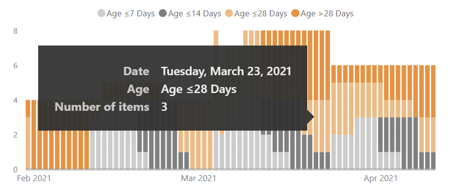
This chart shows both the number of items in progress on a given date, as well as highlighting how old those respective items are. The chart groups the item age into ≤7 days, ≤14 days, ≤28 days and >28 days in progress. It allows teams to analyse two key factors when it comes to stability of flow in your system, helping them both maintain optimising WIP (factor one) and seeing when the age of open work grows (factor two). Teams should try to balance how high the bar is (WIP) and how orange the bars are (Age).
Information Panel
I’ve invested quite a bit of team into creating quite a thorough Wiki for anyone who downloads FlowViz. However I find most people tend to like to just download and figure it out for themselves. I recently watched a Guy in a Cube video where Adam showed a pretty cool way to create an information panel for your report. So I decided to do something similar!
Now, even if people don’t make it to the Wiki, there is a small button that at least can help them if they do get stuck on any of the pages. It was pretty simple to make, just using Google Slides and ensuring transparent backgrounds were there.
The hard part was working it all into the existing bookmarks however, once I got in a rhythm it didn’t take too long. Check it out and let me know your thoughts!
Other Minor Updates
I also managed to rattle through some minor bug fixes, mainly fixing the board column order in the Work Item Age chart and paying off some tech debt in removing unused columns, changing formulas and reducing date ranges for certain queries. The Wiki has also been updated with various new screenshots and I’ve also added some guidance for TFS (I know!) users into the Wiki FAQs, as someone DM’d me on the Azure DevOps Club Slack group asking for help getting setup.
Finally, I’ve moved to experimenting with using the kanban board within GitHub for ideas on both new features and to give people a bit more insight as to what is being worked on or coming soon. Not quite there in keeping it updated but getting there :)
Anyway, the new version is now available - please use the GitHub repo or Azure DevOps Marketplace to download the latest version.
If you have any ideas yourself I’d love to hear them in the comments below or via the Discussion page on GitHub.


